Some Tips on Map Layout & Exporting a Map to Illustrator
If you’d like to finish a map with Adobe Illustrator, that you started in ArcMap, there are a few quirks and best practices you should know about when exporting that map from ArcMap. If you stick with these guidelines/tips, it will make your life a little easier when you get into the Illustrator workspace.
First, design your map layout (page size, map extent and scale) in ArcMap before you even open illustrator or think about pressing export. Think about the elements your final map will contain. Will it have a title block, a scale bar, a north arrow? I usually let the shape and extent of my map subject dictate the final layout not the other way around. I try not to force the map subject into a predefined layout, instead I let the shape of the main feature dictate the page orientation and other elements of the layout.
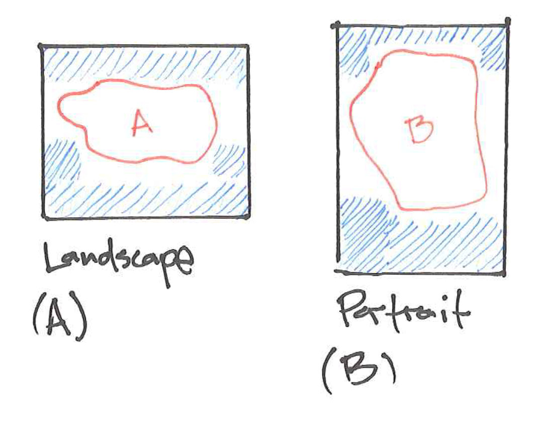
Pretend the features (the red outlines) in the sketches below are my map subjects, maybe two different counties. County A lends itself better to a landscape orientation (long edge on bottom) because of its shape, while County B lends itself to a portrait orientation (long edge on side). This is something I recommend sketching out before setting map scales and setting up a map layout. The areas left in white space, shaded in blue are perfect spots for extra map elements – scale bar, title block, inset map, text, charts, etc. When designing a map to include these extra elements keep in mind the balance of these extra elements as well. Pretend each elements has a weight based on its size, color and boldness and try to balance that weight across the top/bottom and left/right plane of the page. If your title block includes very large black, bold text in the upper left corner, there should probably be some other elements in the lower right corner to balance the aesthetics.
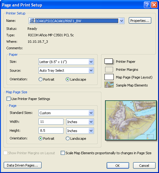
After you’ve sketched the basic layout and decided on the best orientation, you can set the page size and scale in ArcMap. At this point I usually know what my layout size (paper size) needs to be and I set that in ArcMap by visiting the File>Page and Print Setup… menu. I always uncheck Use Printer Paper Settings. I just don’t print from ArcMap, period, and prefer to control the layout with user input. Here’s what the page setup might look like for map A in the sketch above.
This is where you will input, based on the page orientation you have already sketched out/designed, the page dimensions. If you plan to have a full bleed final product, you may want to give each dimension an extra 0.2” to accommodate the bleed area.
At this point, your data frame needs to be distributed to fit the page layout. In layout view select the data frame, right-click, and select Distribute>Fit to Margins to fill the page with your map data frame. If you haven’t already done so, add the data that contains your focus feature and zoom to that feature.
At this point, you can adjust the map scale, to a meaningful scale, to capture your target feature while also allowing enough room for other map elements you’ve planned in your map design. Check out the map scales utility for help with this. At this point in my career, I always set a scale that translates to some round unit. The absolute scale 1:6,354,233 translates to 1”=100.29 miles on the map and that’s tough to translate on a paper map but 1:6,336,000 translates to 1”=100 miles. That little bit of extra work will make your map audience’s life just a little easier and it will make you a better cartographer. Also, keep in mind that down the production line you must print with NO SCALING or the nice round map scale you set won’t be accurate.
After you’ve set up the map extent and scale nicely, you’ll want to bookmark your work. Trust me on this one, just do it. Go to the top menu hit Bookmarks>Create and name your bookmark so you’ll remember what it means when you come back to update this map in 6 months. You’ll thank yourself at some point if you make this a habit.
Let’s jump ahead a bit and assume you’ve added all of the data you need and set up labeling properties for each layer that needs them as well. Here are some tips for symbology and labeling when exporting a map to illustrator:
SYMBOLOGY
Polygons – do not include strokes (outlines)
these will be broken apart and add extra junk to the illustrator file, creating more work in the illustrator environment and you’ll have to apply a stroke again in illustrator anyway
Polygons – apply different fill colors to each layer
this will make it easier to select and group layers in illustrator (illustrator has functionality that allows you to select all features with the same fill as the feature you have selected)
Lines – Use a cartographic line with round joins
this will create a cleaner look in illustrator, you may still have to join disjointed lines due to the way line features are exported but with an appearance applied to a group in illustrator you may get away with a little less work for the same appearance
Lines – apply different stroke colors to each layer
this will make it easier to select and group layers in illustrator (illustrator has functionality that allows you to select all features with the same stroke as the feature you have selected)
Lines – avoid complicated, cased symbology
these effects/appearances are much easier to create & apply in illustrator and will produce a cleaner look – just keep it simple in ArcMap before exporting to illustrator, you are using ArcMap as a tool to get data into illustrator at scale
Points – use a simple characters (simple circle, square, triangle)
these will be exported as font characters and extra outlining or gradient fills will make working with and organizing these features more difficult – this will also make it easier to resize and convert the text to individual shapes in illustrator
Points – apply different fill colors to each layer
similar to polygons and lines this will make it easier to select and group layers in illustrator (illustrator has functionality that allows you to select all features with the same fill as the feature you have selected)
LABELS
Labels – apply different fill colors to each layer’s labels
similar to polygons and lines this will make it easier to select, group and adjust the font for different types of labels – instead of spending time adjusting type in ArcMap, which is not the best typographic tool, just apply different colors to each layer’s labels and use illustrator to change fonts and colors to emphasize labels
EXPORTING
Before exporting your map layout, ensure that there are no raster layers visible and that no visible layers have an degree of transparency applied to them. If there is raster data visible or if there is a transparency applied to any visible vector layer, that layer and any layer beneath it in the stacking order of the map’s table of contents will be rasterized on export and you will not be able to manipulate the layer’s appearance in illustrator.
There’s really no need to layout a title at this point, you can take care of that in Illustrator. If you have incorporated an inset map in your design, you will want to add that data frame and set up the symbology and labeling in a similar manner. Also, add a scale bar or record the scale that you’ve used so that you can build your own in Illustrator (remember, if you set a scale that has a 1” equivalent you can build a nice scale bar in Illustrator by creating 1” wide rectangles). When you are ready to export your map layout from ArcMap go to File>Export Map….
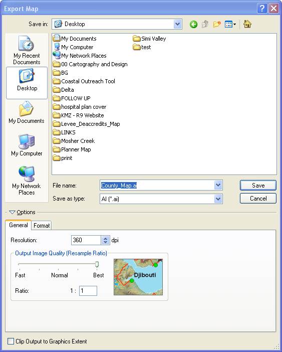
Navigate to the proper directory and enter a name for the file you are going to export and Save as type AI(*.ai) (that’s the extension for an illustrator file).
In the General tab; set the Resolution at 360dpi (sounds arbitrary but apparently illustrator likes this in multiples of 90 and 360dpi will retain high detail in your map features), and set the image quality to Best.
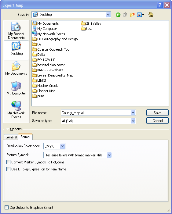
In the format tab make sure the destination colorspace is set to CMYK (cyan, magenta, yellow, key [black]). This is the colorspace used in printers, so if your map is destined to be printed, use CMYK. If your map is only going to be shown on screen, you can change this to RGB (red, green blue) the colorspace used by projectors and monitors. I leave the rest of the settings as shown but I encourage you to experiment with different export settings.
Keep in mind that these are the preferences that have come about out of my preferred workflow and you may have slightly different settings that work best for you. This is just a start, guidelines to help ease into the daunting ArcMap to Illustrator workflow.
Opening this file and organizing groups in Illustrator will take another set of tips which I’ll write about later. For now, try to export a Illustrator file from ArcMap using these guidelines. Attempt to open the map in Illustrator, explore the contents and experiment with styling the map and finishing the layout in the Illustrator workspace.


