Building a logo with arcmap
Here’s how I built a logo for my presentation at NACIS last year using only arcmap!
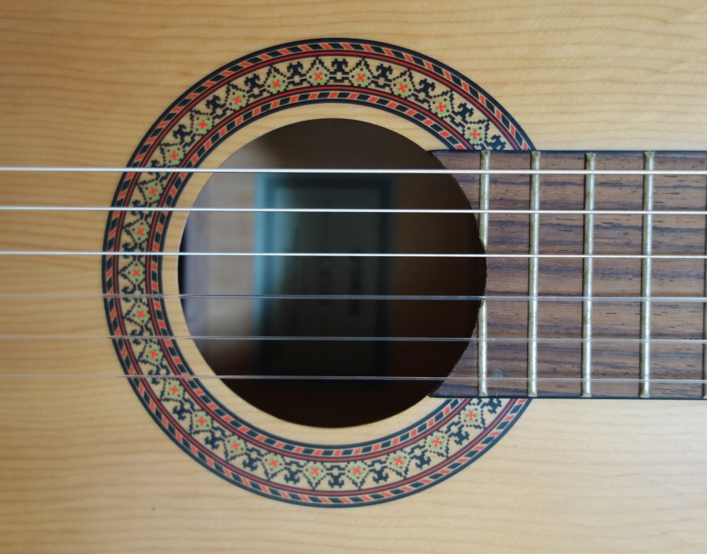
I wanted to demonstrate that design can be done in ArcMap, this was my inspiration to design an arbitrary logo, my cheapo nylon yamaha, which I love the rosette on:
Here’s a video of the process:
And here’s a step by step with some explanation.
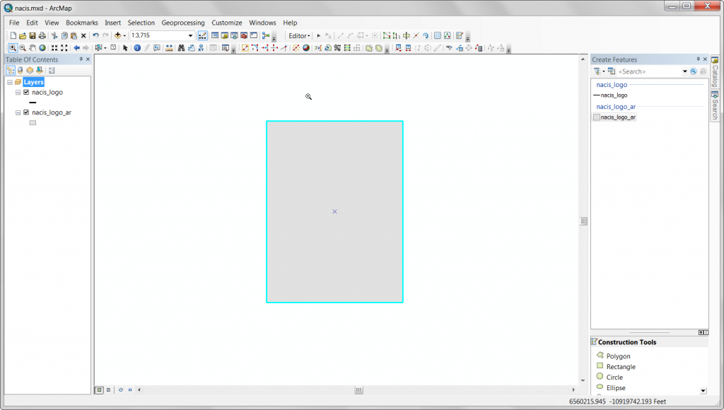
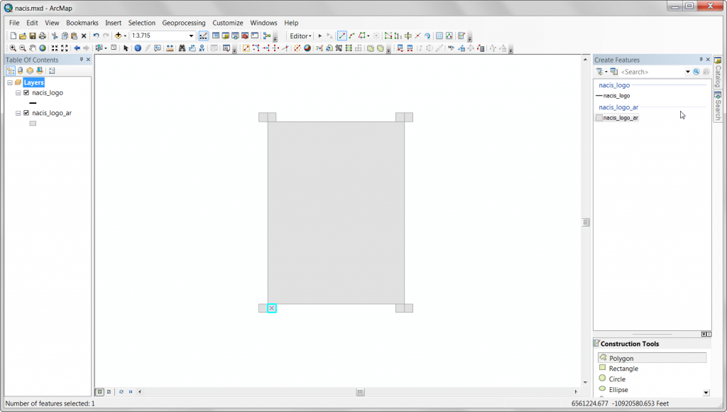
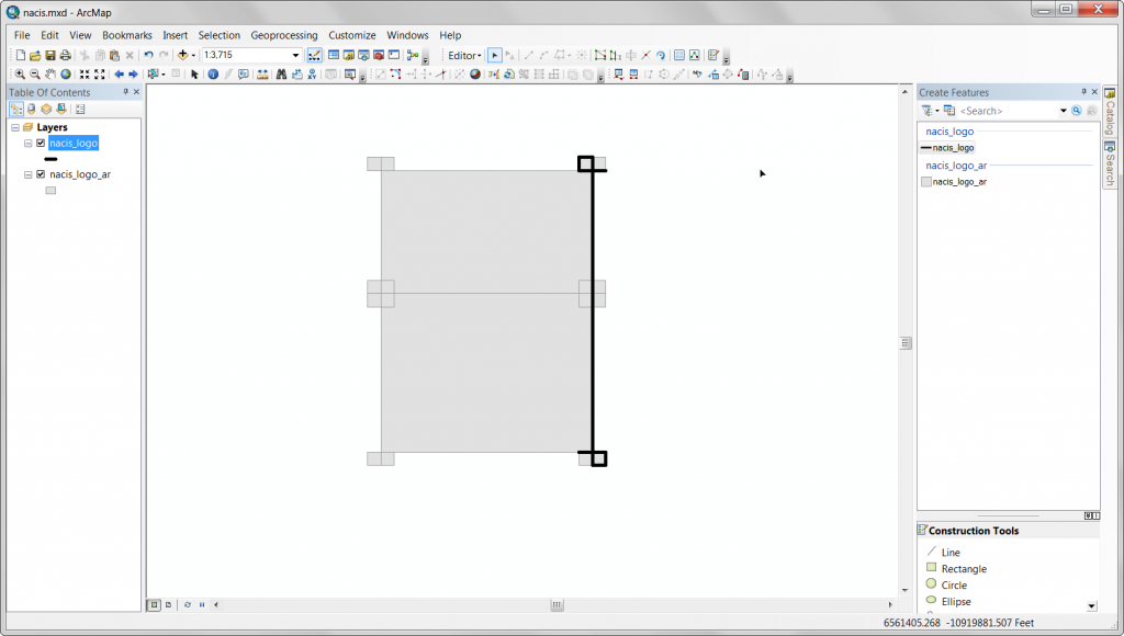
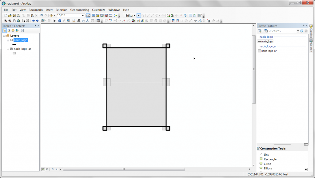
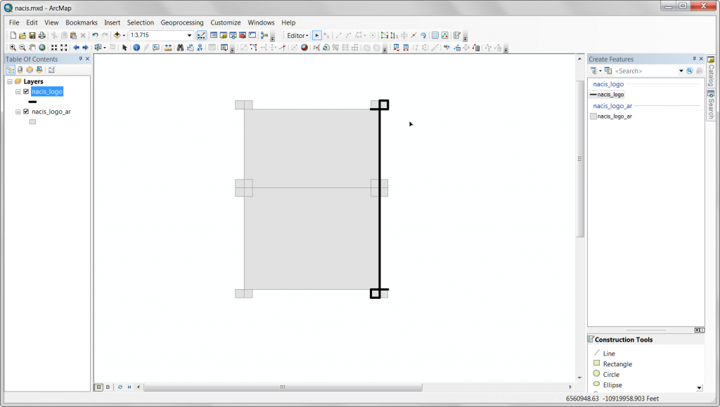
Start by creating a template to build the type, just a rectangle. It’s in 3:4 proportion.
Add some detail to the template.
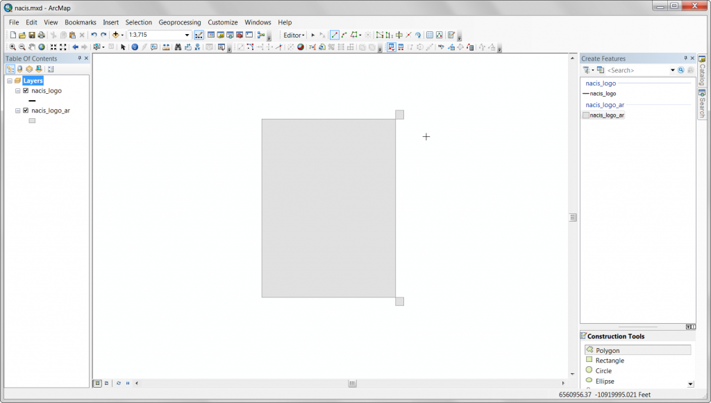
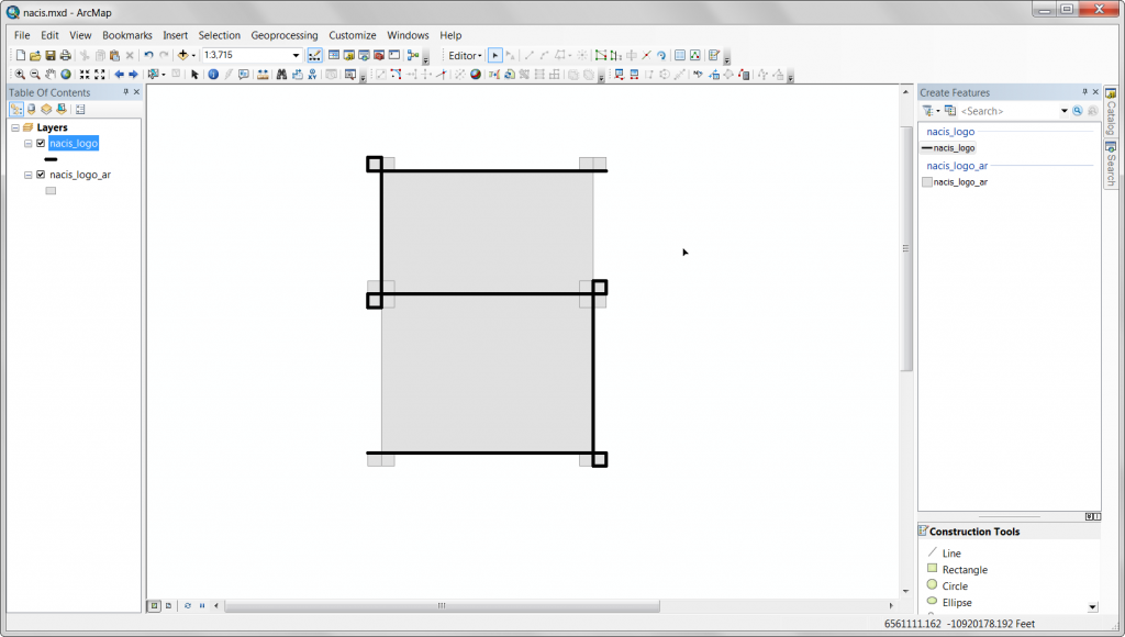
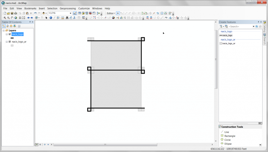
A smaller square, one on each corner.
Corner vertices snapped together.
I want to add more detail.
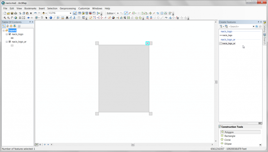
Copy one of the smaller corner squares, in the space adjacent to each corner.
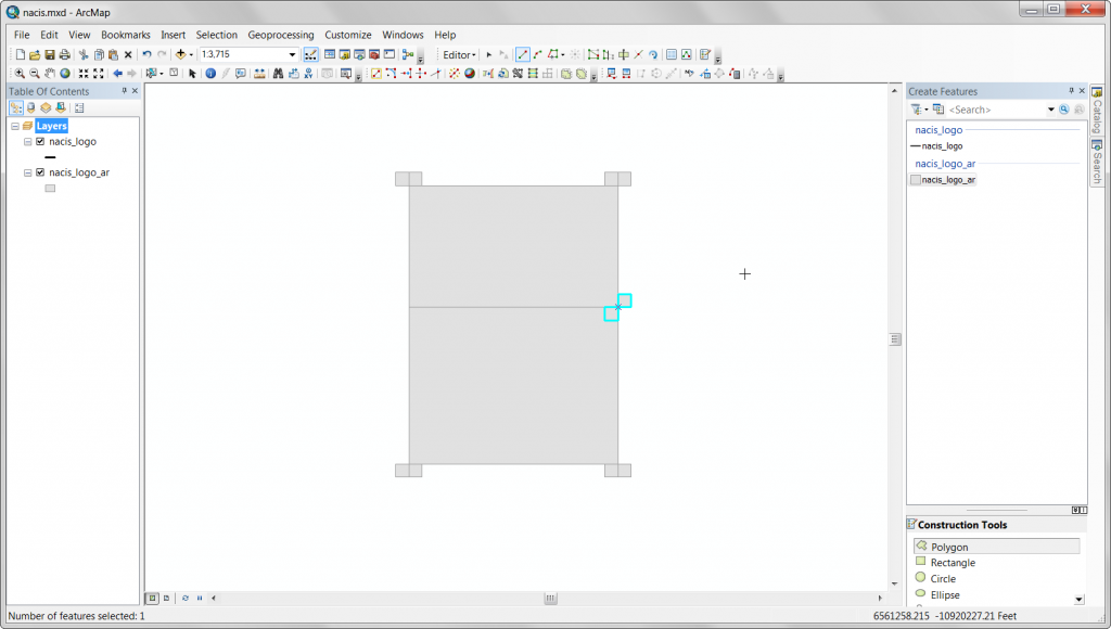
Split the main rectangle for things like the bridge in the letter A.
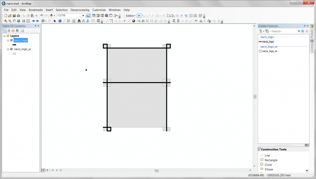
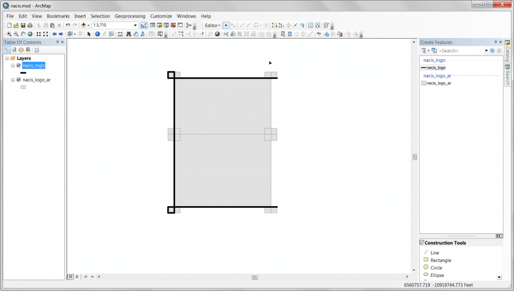
Create additional small squares to build the letters.
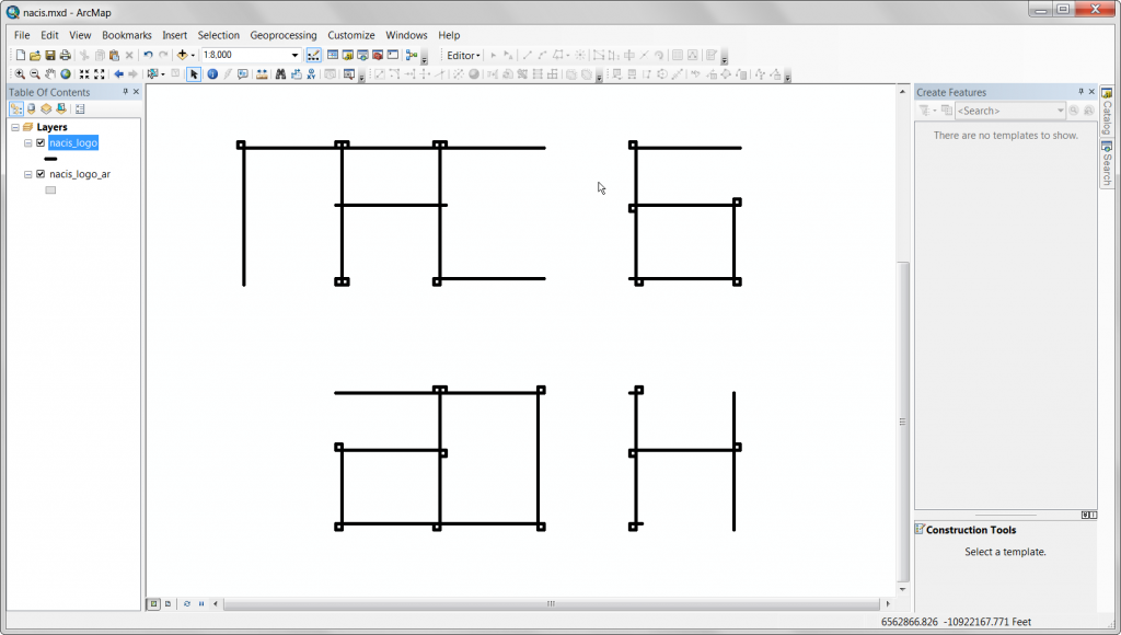
Here’s the first letter, using the template rectangle/squares to draw the shape of each letter. Create features and snap to the template vertices.
The A, I’m spelling out “NACIS 2014” through this…
C!
I!
S!
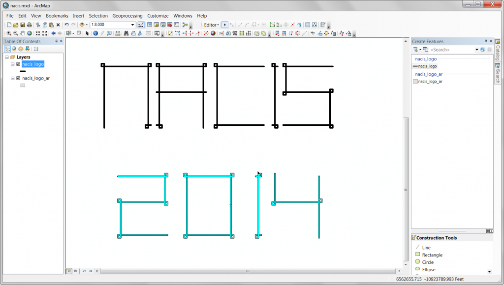
As, I create each letter form, I’m using the move command and moving each letter from “NACIS” vertically the same amount, and horizontally in incrementally larger amounts for each letter so that they are spaced out to form a readable word. The numbers “2014” are moved vertically the same amount, but less than that amount the letters in “NACIS” were moved, and horizontally moved to form “NACIS 2014” on two lines.
0
1
4
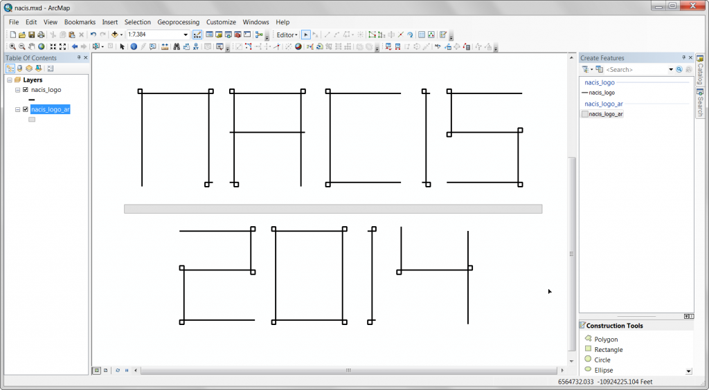
Here’s what the letters look like after creating each and moving them off the template features.
The next step is to move each letter so that they are spaced out, I just select the individual characters and use the move command to get the kerning (letter spacing) the way I want.
Once the individual characters are spaced nicely, I select each character in 2014 and move it in unison and in relation to “NACIS”.
After moving the two different words in relation to one another, with some additional individual character spacing adjustments, I’m happy with the character and word spacing.
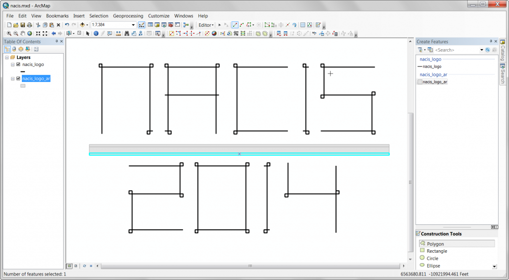
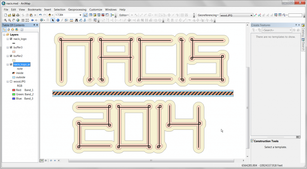
Now I add an additional rectangle between the two words for decoration.
Above and below that, two shorter rectangles of the same width.
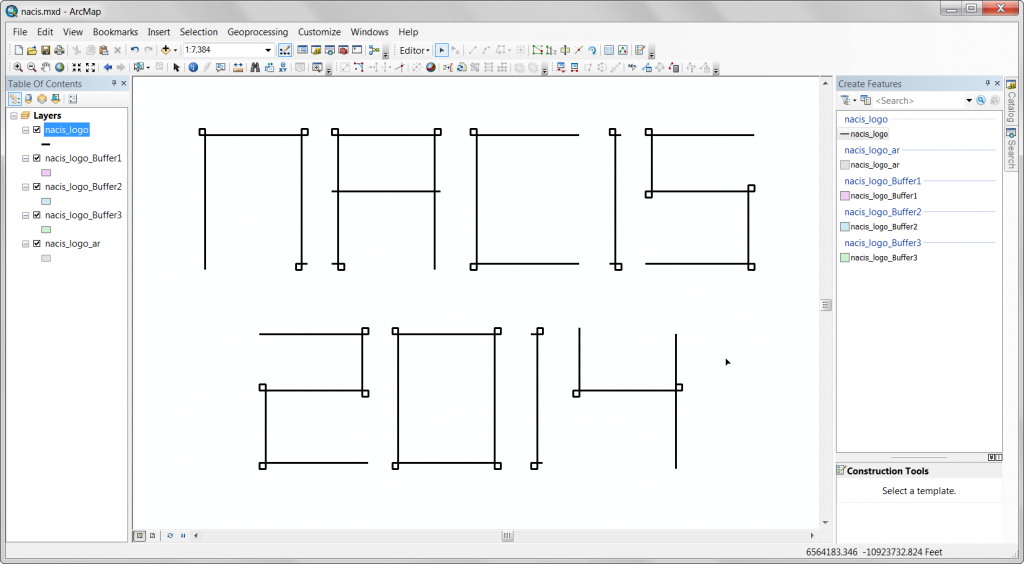
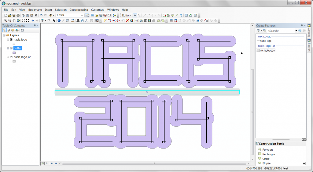
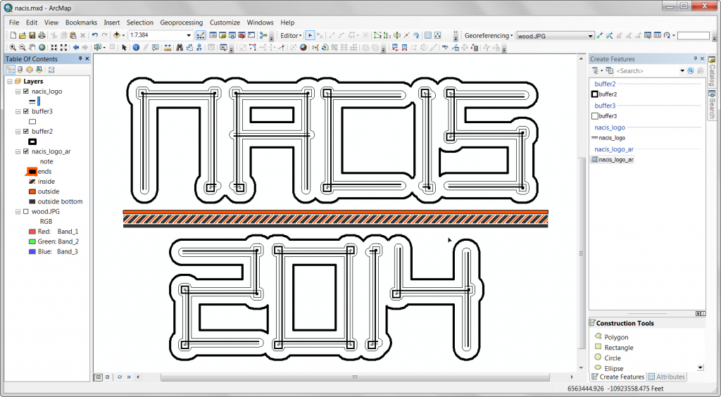
Now I buffer the characters.
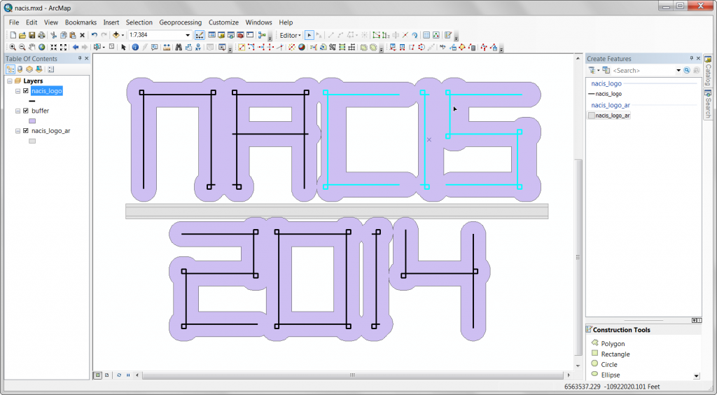
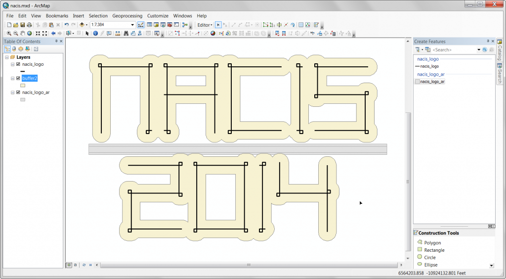
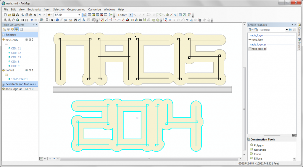
I’m not happy with the gaps in the buffer, so I move those characters closer and ditch the first buffer.
Here’s the second attempt at the buffer.
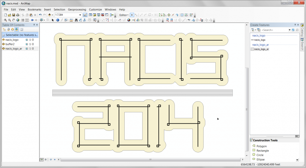
I need to move the characters and buffers together to create some space for the horizontal bar.
Happy with this spacing, moving on.
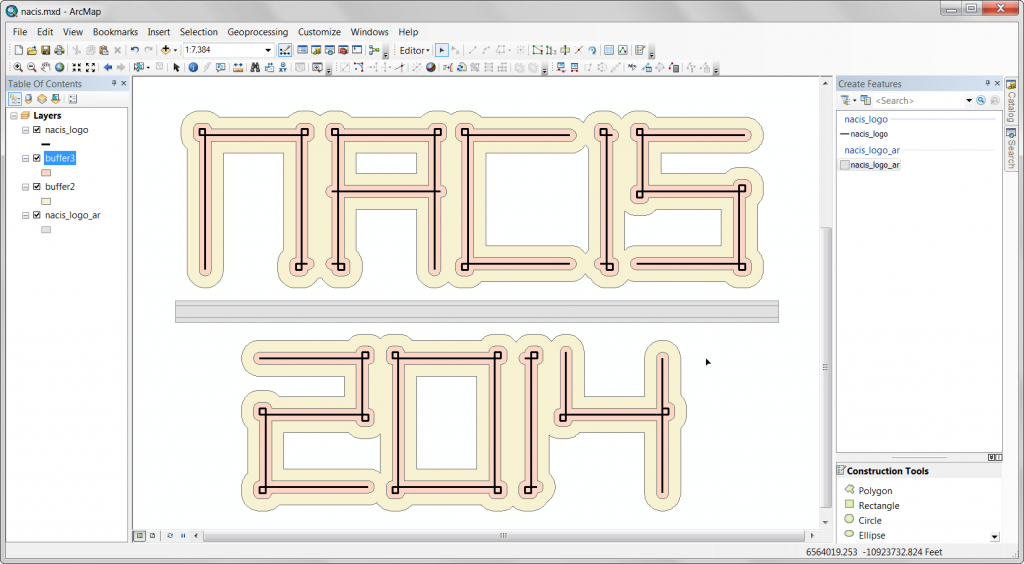
Create an additional, smaller, buffer around the characters.
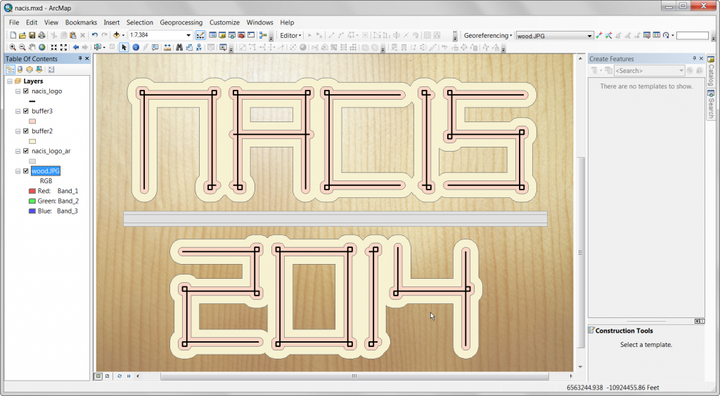
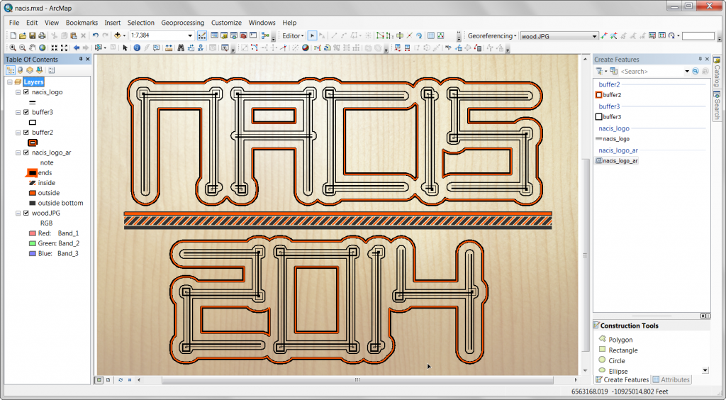
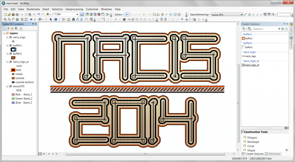
Add a picture of the wood grain from my aforementioned guitar then georeference it behind my lettering.
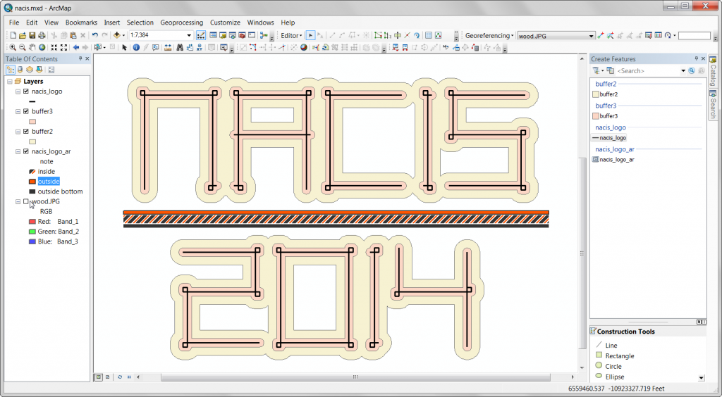
Turn off the image and start styling my features.
Adding some style to the horizontal bar, borrowing inspiration from the guitar.
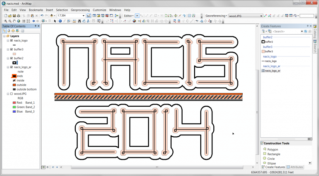
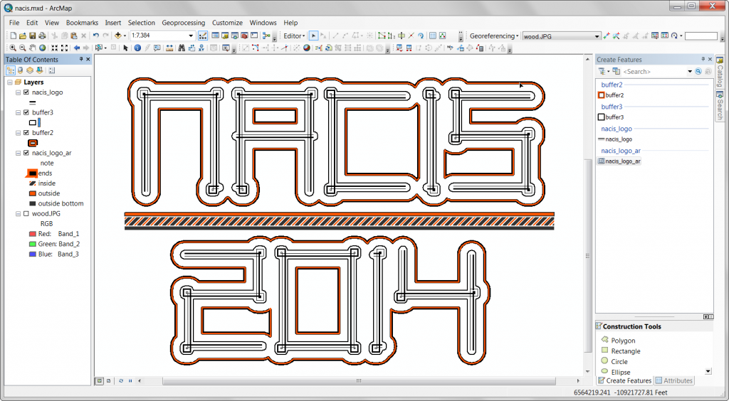
Now start styling the buffers.
And the characters themselves.
Adjustments to the buffer’s line style.
Finally, turning the image back on…
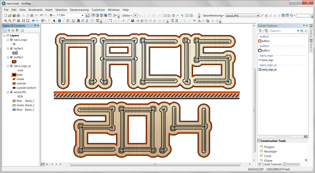
…and clipping it (data frame clipping) to the largest buffer.
Some polishing, and there it is.

