A Multivariate Line Style
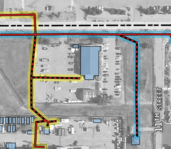
Wanted to share some symbology I developed for an electric utilities map recently. There were multiple variables to portray over aerial imagery. The first thing I did for this map was to adjust the imagery to black and white and tone down the contrast to really let the lines pop, then I started working on the lines.
The lines here represent the path of electric lines, overhead or underground (solid or dashed) and the circuit the lines are on (background semi-transparent color).

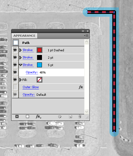
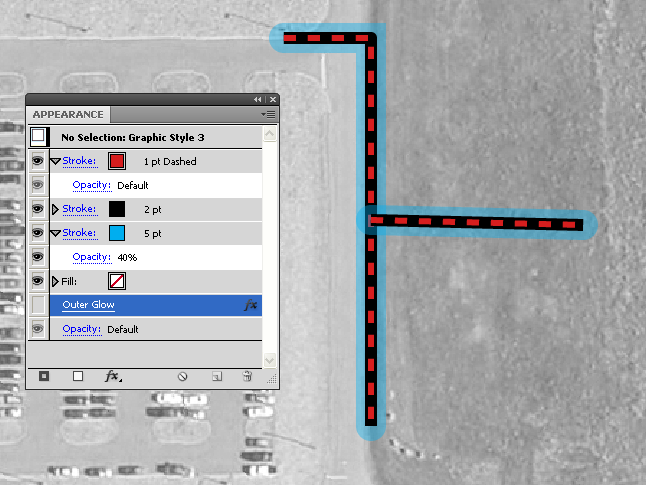
It is possible to build this type of symbology on one line with a stacked set of stroke styles, and save as a graphic style to easily symbolize a whole layer.

I did not use graphic styles to achieve the final effect due to some cleanliness issues. Note the overlapping at the line joins.

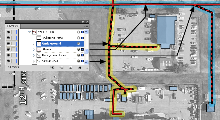
Instead, I built graphic styles for the dashed underground line (red dash, no casing) and the solid red overhead line which are applied to the “Underground” & “Above” groups. To create the casing effect (and contrast the black & white imagery) I copy/pasted-in-back all of the linework from the “Underground” & “Above” and grouped them into the “Background Lines” group to which I applied a solid black stroke graphic style. For the remaining circuit symbology, I again copy/pasted-in-back all of the electric linework and sub-grouped based on the circuit. Next, I applied the semi-transparent stroke appropriate to each circuit. Notice the cleaner joins in the image below.


1 Comment
Langdon
January 28, 2014Thanks for the tip! I was struggling with ugly line ends, tried joining and compound paths but this worked much better.