Anatomy of an Executive Summary
I love InDesign. With some creativity, you can do some really cool things with InDesign. You think DS Mapbook or Map Logic Layout Manager are good? InDesign blows them away. But when you combine InDesign, ESRI ArcMap, Illustrator, Excel, Python, ArcCatalog, Word and Photoshop you get something exciting. Look out for the Anatomy of the Delta Mapbook. Here’s the document I’ll cover in this article.
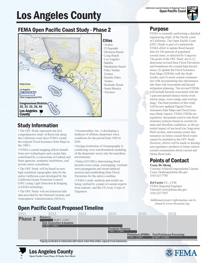
I created this executive summary with ArcMap, Photoshop, Illustrator and InDesign. I’ll show you how it’s put together and summarize each step. The product needed was an Executive Summary for each of five coastal counties in Southern California. Each summary shared common elements but each required a unique map and some other features.
I started with some idea of the general layout, I had to think about the final layout before starting maps and other content. Knowing my final media size [letter page – see paper size cheater] I try to image how a map, some text, graphics and other elements could fit together. I’m mostly skipping past the design part because the design is up to you. On this project I had feedback, help and inspiration for the design from Lisa Messano and Wynne Kwan who work with me here in the Oakland Baker office. Thanks!
So after I start composing the graphic content for the document, I create each element as I go, sometimes skipping from one element to another if I get a good idea. Some of the content, the text, has been written by someone else and I simply place and style it.
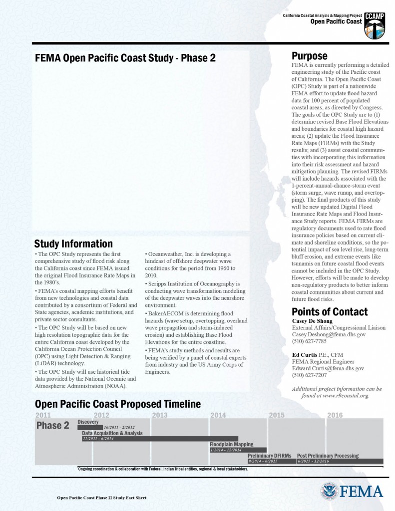
Here’s what my master page looks like in InDesign.
Notice that the elements on this page are only those that are seen on every page in my document where I apply the master page. This functionality is an important thing to keep in mind during the design process.
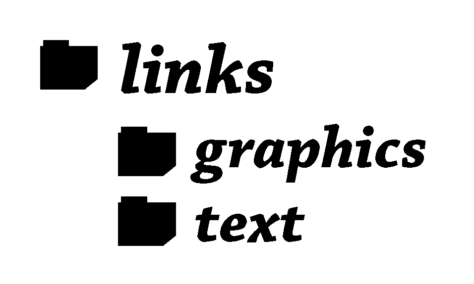
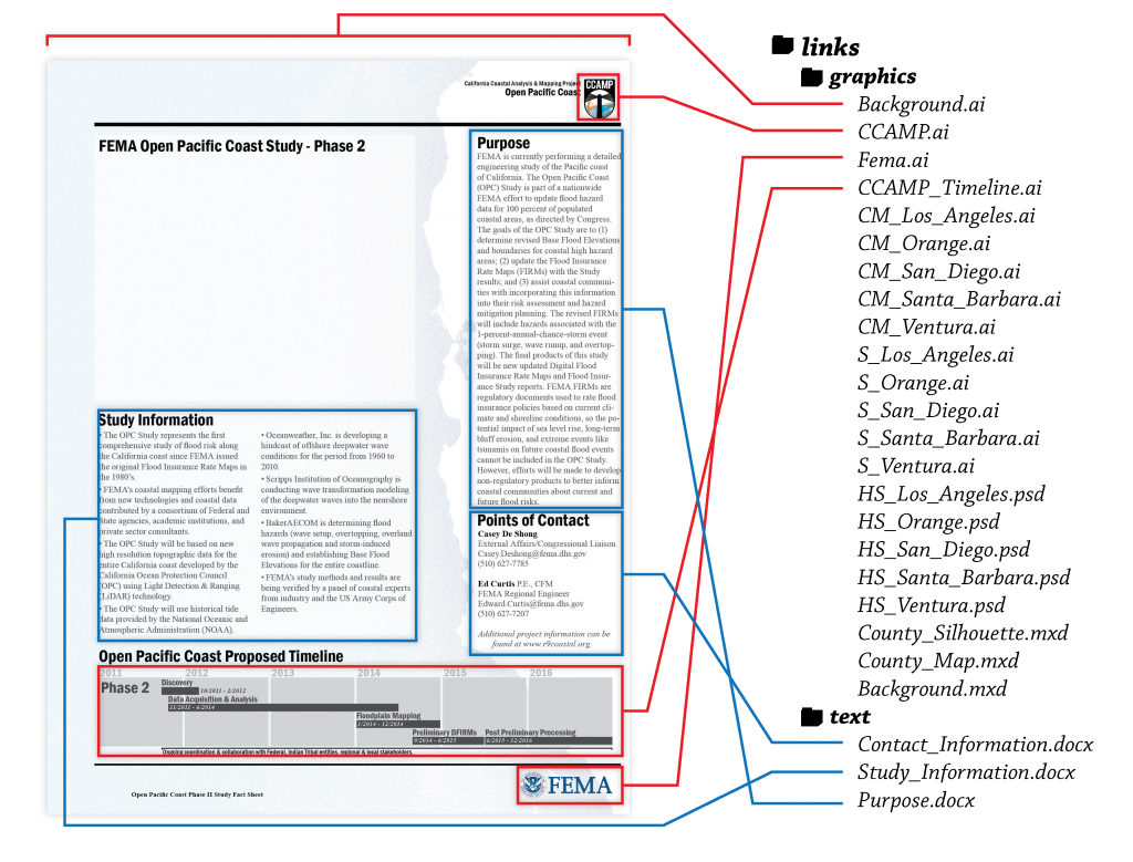
The master page contains the background design, text boxes, graphics, titles and placeholders that will be consistent across each page of the document. When setting up the master pages and creating the content piece by piece, I’ve been following a simple folder structure to organize the content.
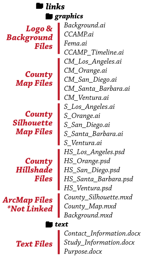
This is how the files look in those folders, I’d have the InDesign file in the root project folder and all the content in the appropriate link folder.
There are a few files in the links directory that are actually not placed in the document. Sometimes I keep intermediate files here as well. I like to keep the root clean with only the output file and the working InDesign file.
As I create content and save the files into the links directory, I start placing the files into the document. Using text frames & the place command for text and using the place command for graphics I can start building the master page. Here’s the layout of the page and the elements that are placed. Here’s the relationship of file links and the layout of the master page.
The tricky part of designing the layout and creating the maps is setting the frame size of the map and other graphic elements and sticking to it. You don’t want to create five or more maps only to find out that they don’t fit your layout and you’ve got to go recreate everything. Point – Design a solid grid like layout and stick to it, design the content to fit into the design.
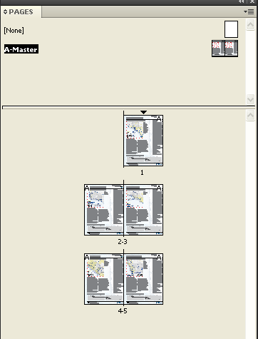
Here’s a quick shot of the pages panel in InDesign. Notice the master page A is applied to all five pages. This means I’ve laid out the background elements once in the master and it is applied to each of the five unique county pages. If I change something in the master it is reflected on all pages. I don’t have to go to each page and do redundant edits.
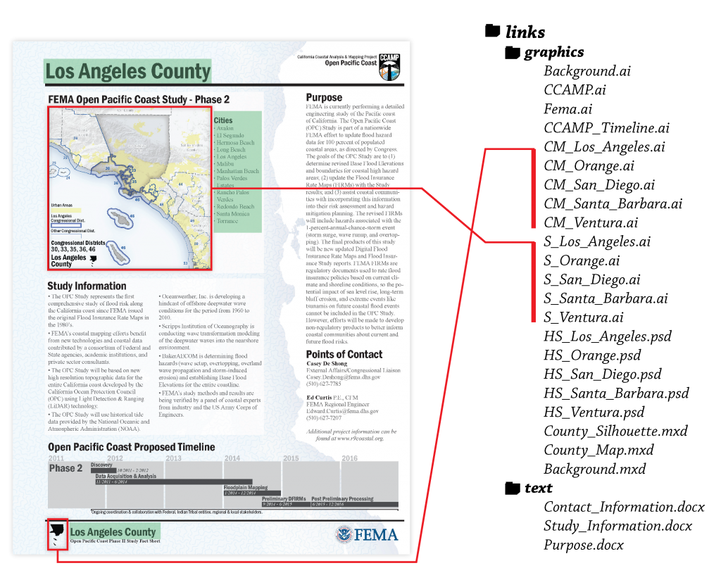
The image below reflects the work to be done on each individual page. There are two links to content files and a few minor text edits for each page. Notice that the graphics links reflect a consistent naming convention so I know exactly which files to choose when placing the links. The manual text edits are shown with a green overlay in the image. The easiest way to maintain consistency for the manual text is to add the text to the first page then Copy & Paste in Place on the remaining pages, then edit the text to reflect the right county.
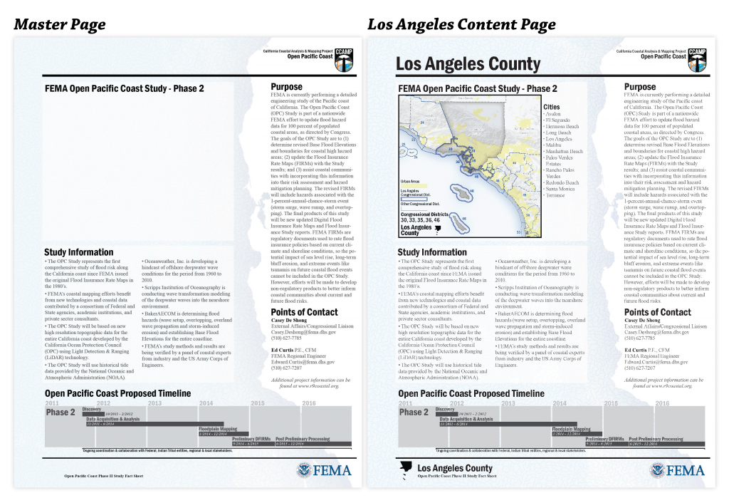
Here’s a side-by-side comparison of the master page and the Los Angeles County page.
I’ll have some more technical articles about using InDesign in the future. The Anatomy of type of articles are meant to show the bones of how I put certain projects together.
If you have any requests for more technical articles or anything else, leave a comment or drop me a line using the contact form.



1 Comment
Whitney K
March 18, 2012Hi Brian,
This is a great article, thanks. I’d be interested in hearing more about how you assemble a map book as a whole… how you choose the layout, colors, prioritized symbology, etc…
Thanks!
Whitney