David Rumsey Map Collection Viewing
Recently, I had the opportunity to view much of David Rumsey’s map collection at his house in San Francisco. As an attendee of State of the Map, Open Street Map’s (OSM) annual conference, I was invited to this special viewing and couldn’t pass on the chance to meet David and also see and touch a lot of important historical maps. As a cartographer this was informative and inspirational. I studied the cartographic techniques on display and was generally amazed at the detail, fine linework, use of color (usually one to three colors on the best maps I saw) in maps dating to the 1700’s.
If you don’t know who David Ramsey is check out his website here, any map enthusiast or cartographer should probably already know who this is but if not, check it out:
Here’s a bunch of pictures from the tour. I took these with my phone, please pardon any graininess, overexposure, underexposure, bad composition and don’t look too closely at the photomerges.
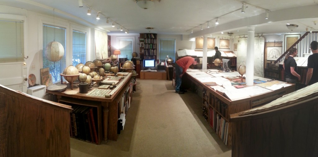
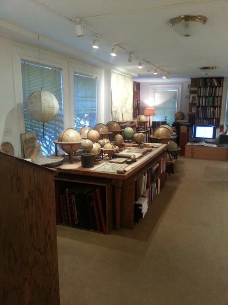
This is the room we started in, it’s filled with globes, atlases, gazetteers, map books, roll up maps, wall maps, map games, map pillows, etc.
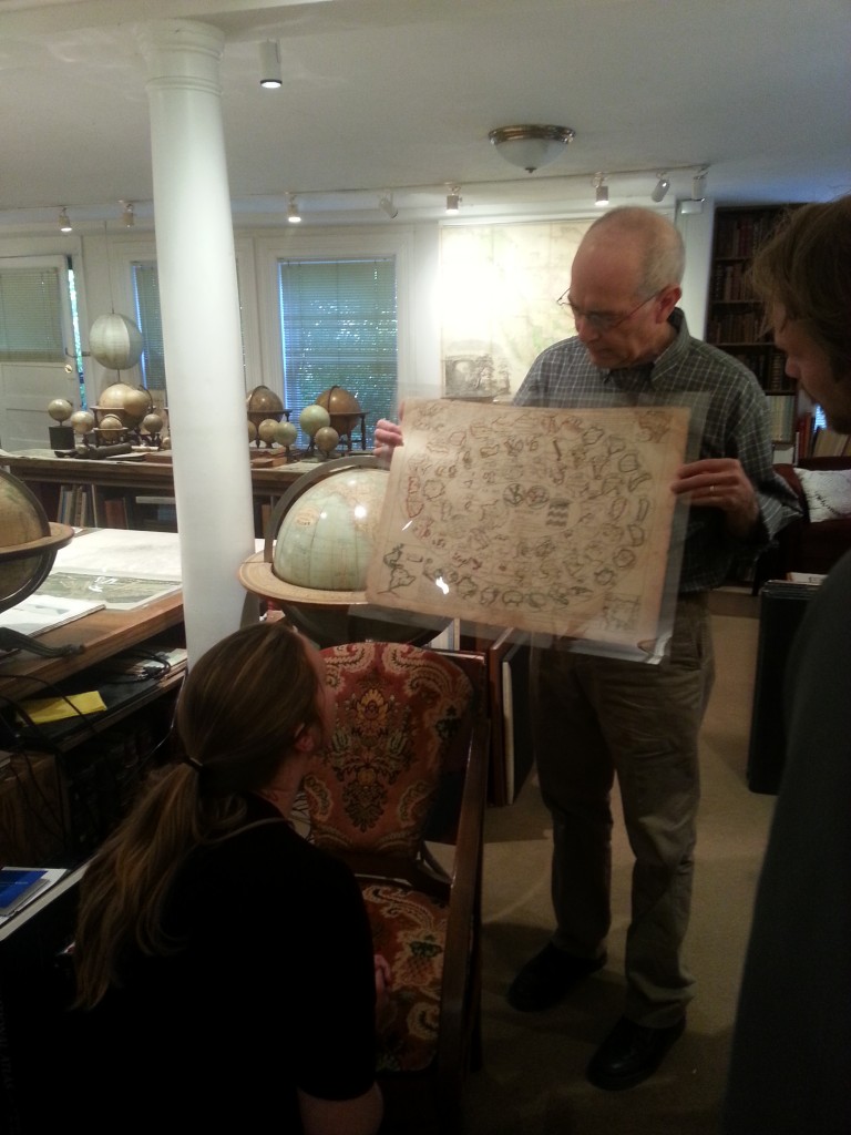
David started by describing this map game from the 1700s ending with France at the center of the universe.
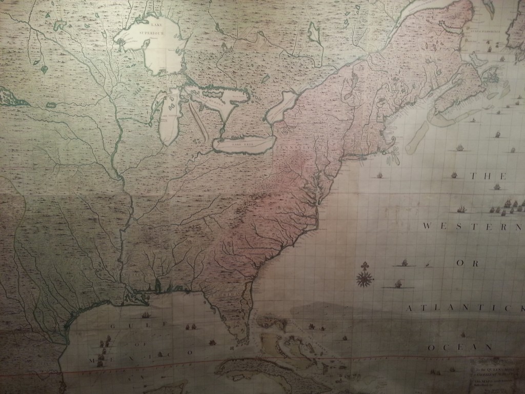
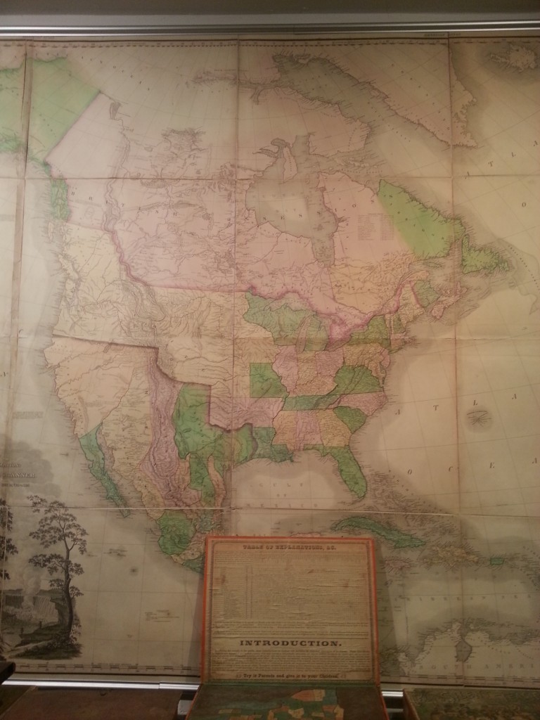
This was the first map I noticed when we went downstairs, very large ~9’ wide and 6-7’ tall.
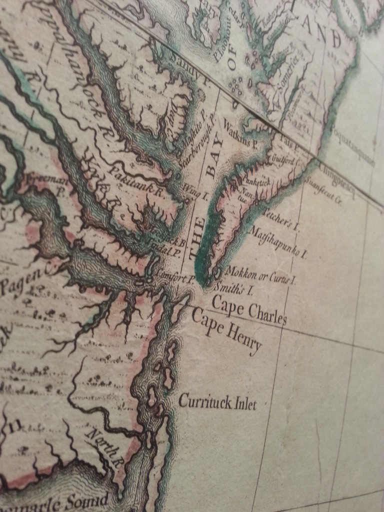
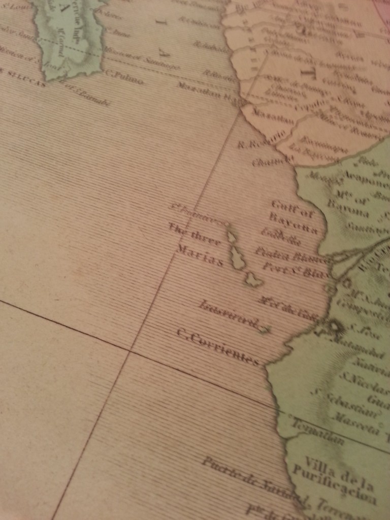
A detail shot of the map above, the coastal isolines create a nice figure ground relationship that pops the land up off the page.
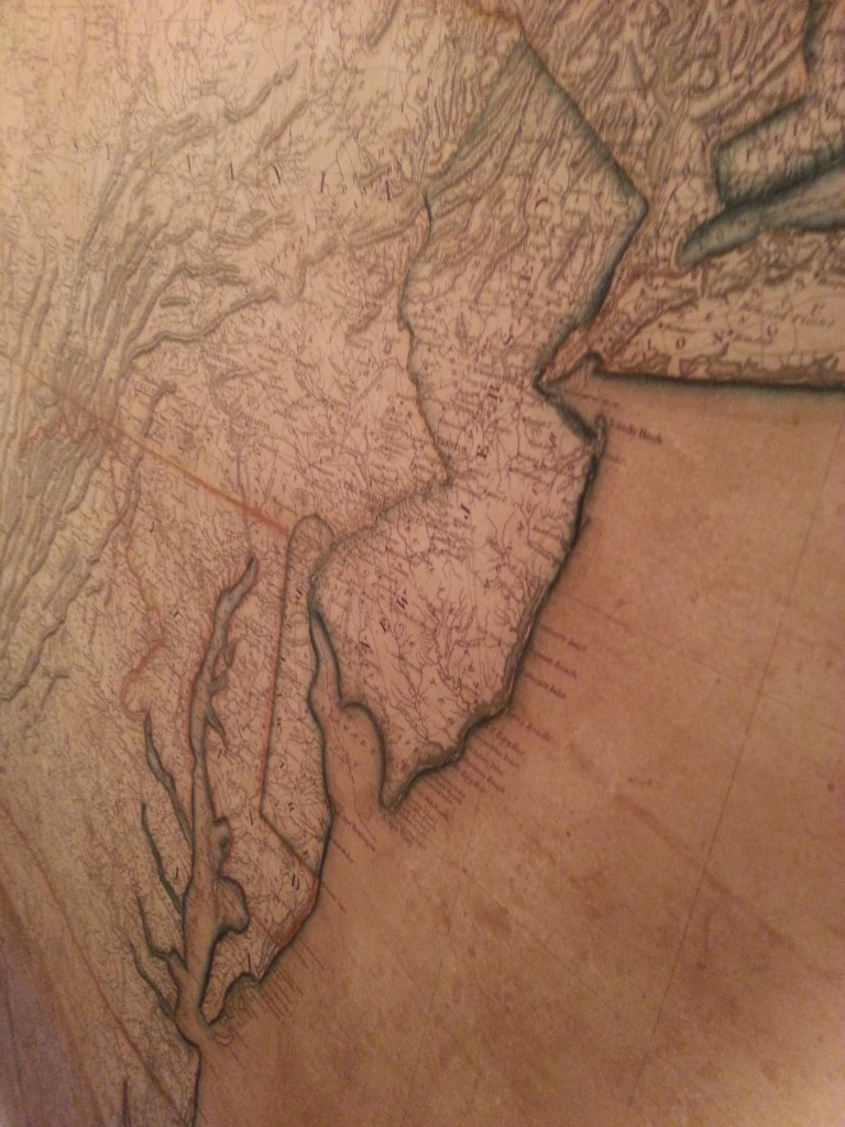
This wall map is similar to the first but obviously younger, notice the shape of Florida and more states forming.
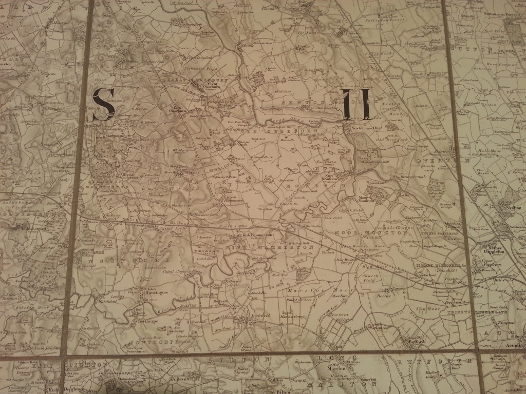
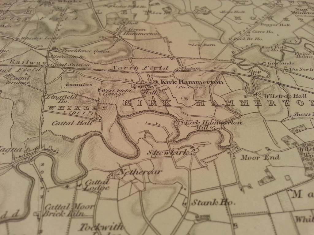
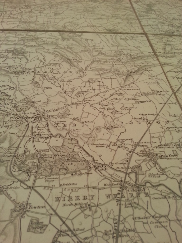
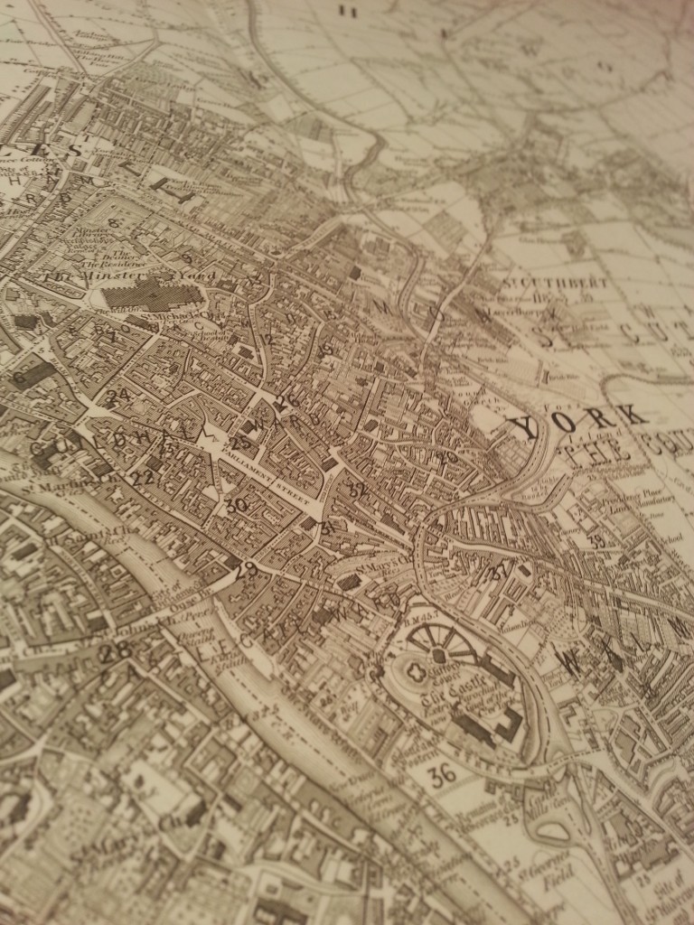
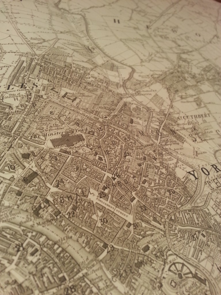
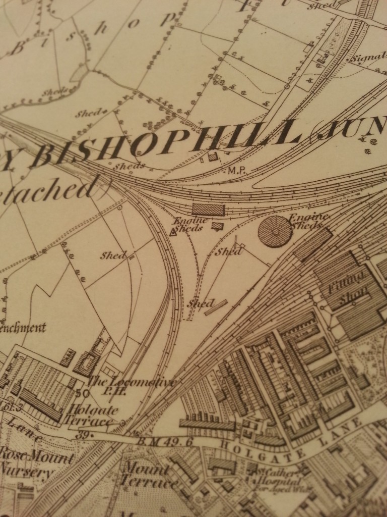
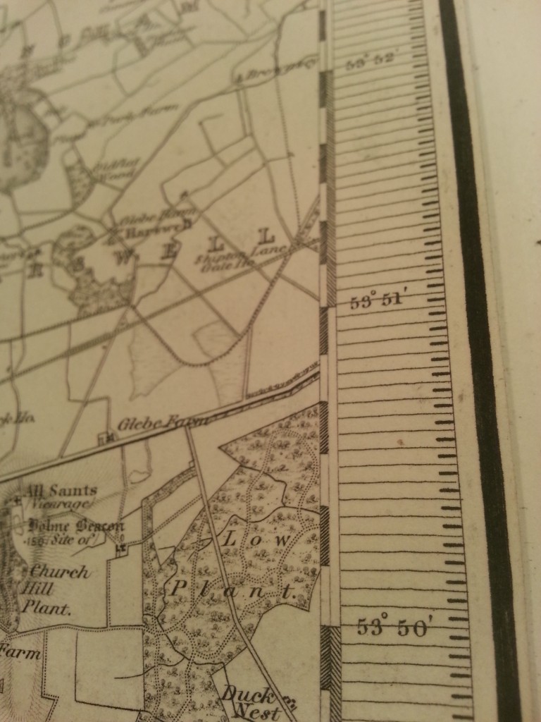
A few shots from a survey map set. The features on these maps are to scale, down to the width of roads and railroads.
Notice these maps are in one color but degrees of shading and variations in typography allows the viewer to pick out features. There is a strong visual hierarchy present with one color used.
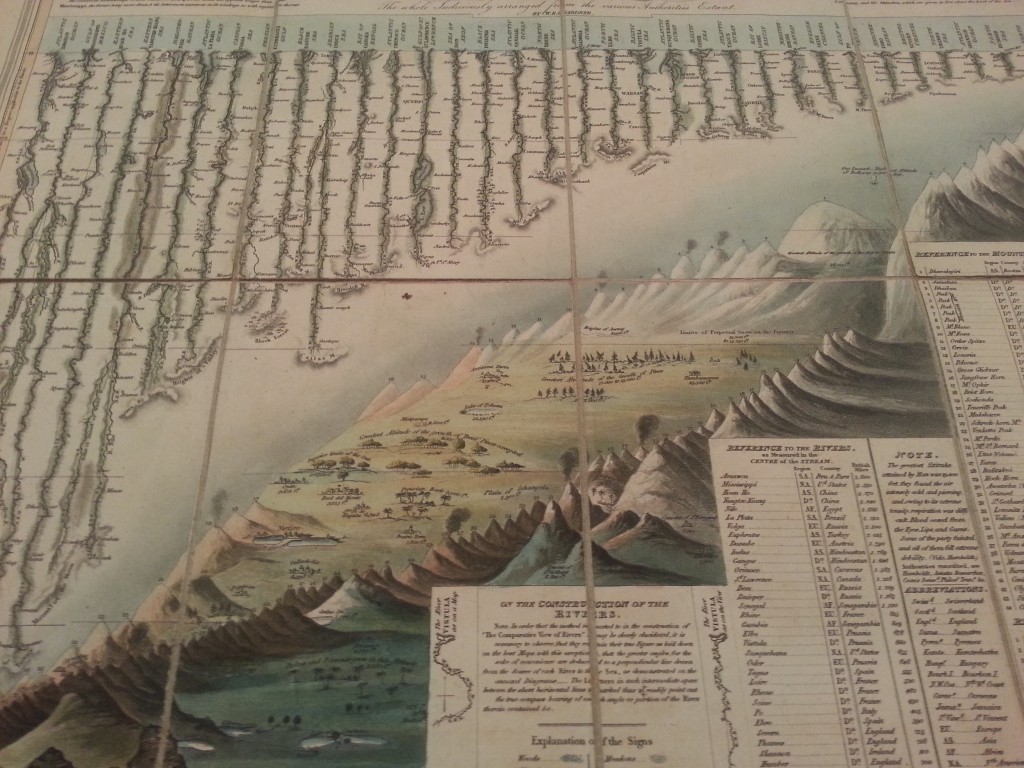
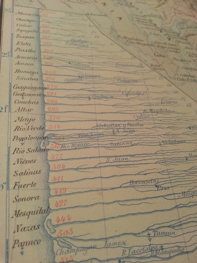
A couple cool river compilations.
I want to try this technique, parallel horizontal lines from the shoreline, the stroke of each gets thinner & lighter as the line moves from its origination at the shoreline.
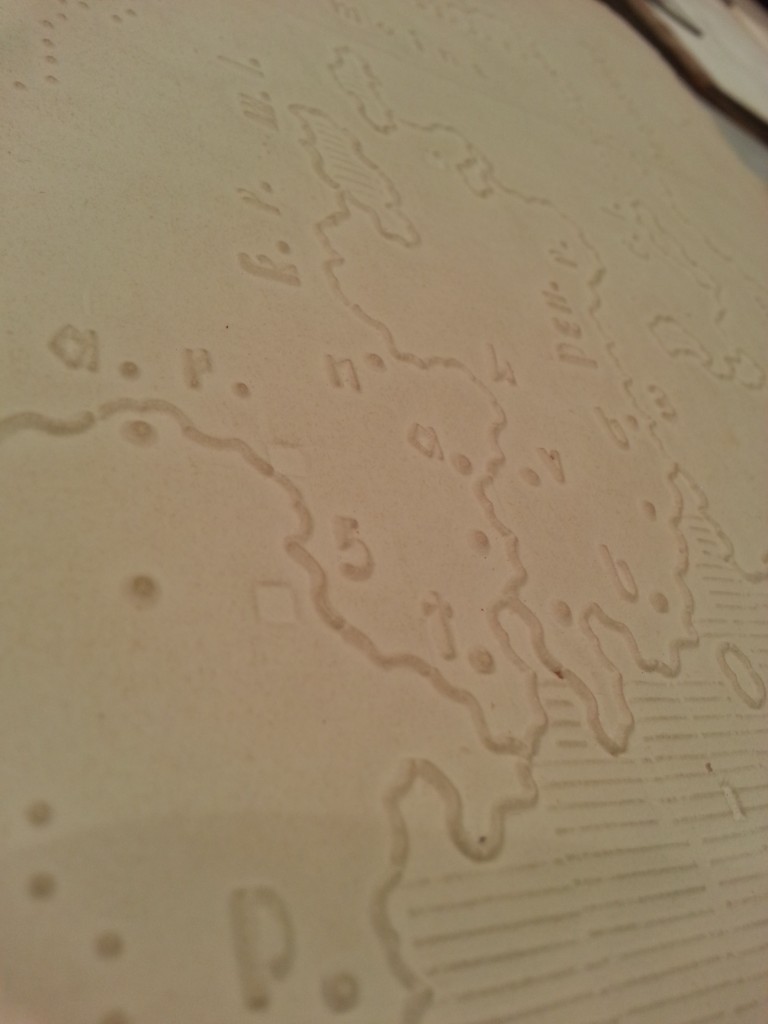
A map with raised features for blind children to study geography.
Here’s the second map room.
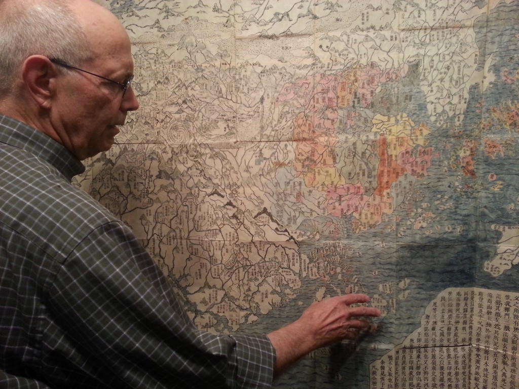
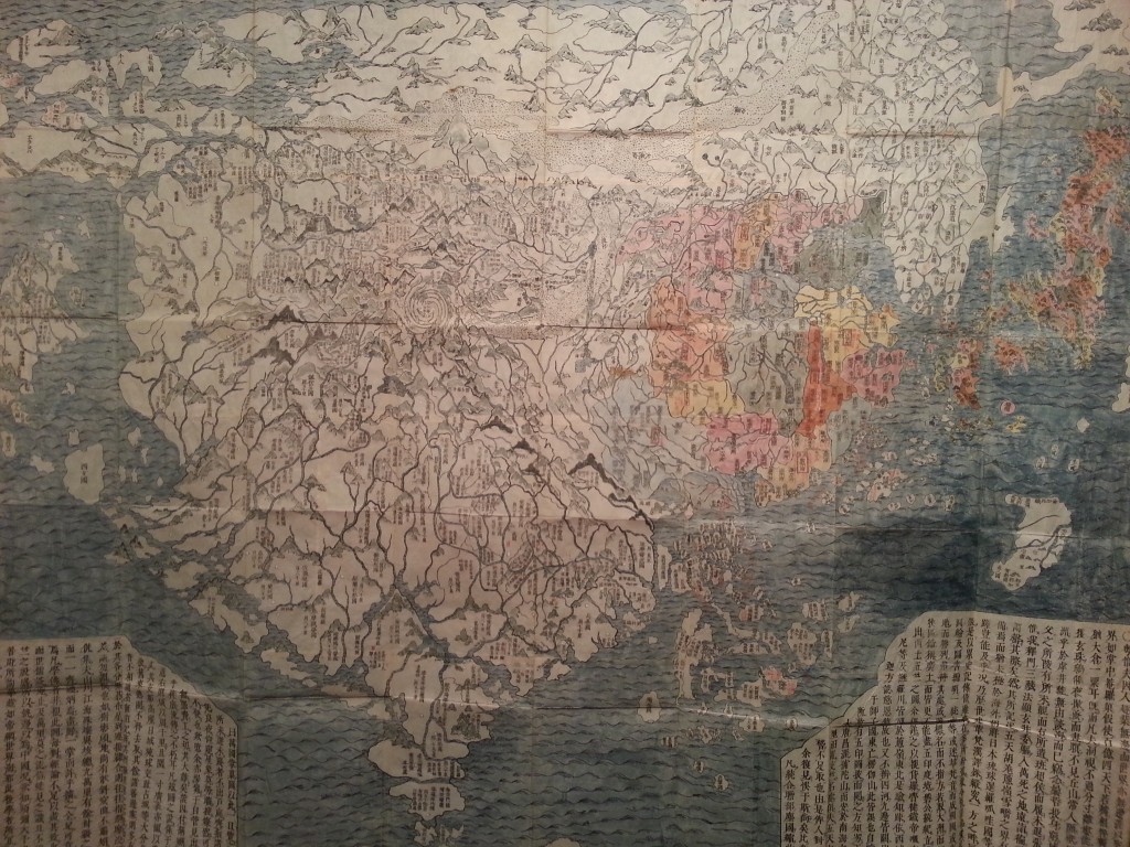
David describing an 18th century map from Japan in map room #2.
India is bottom center, Japan top right, China the colored portion. North America the small feature right edge at the center of the map.
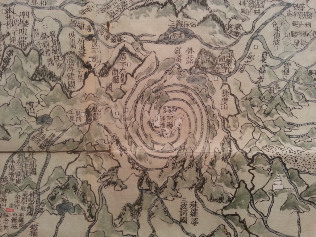
The center of Buddhism, I believe this is Mount Kailash but I’m not 100% on that.
This is behind the Japanese map. Very nice subtle use of color and great typography.
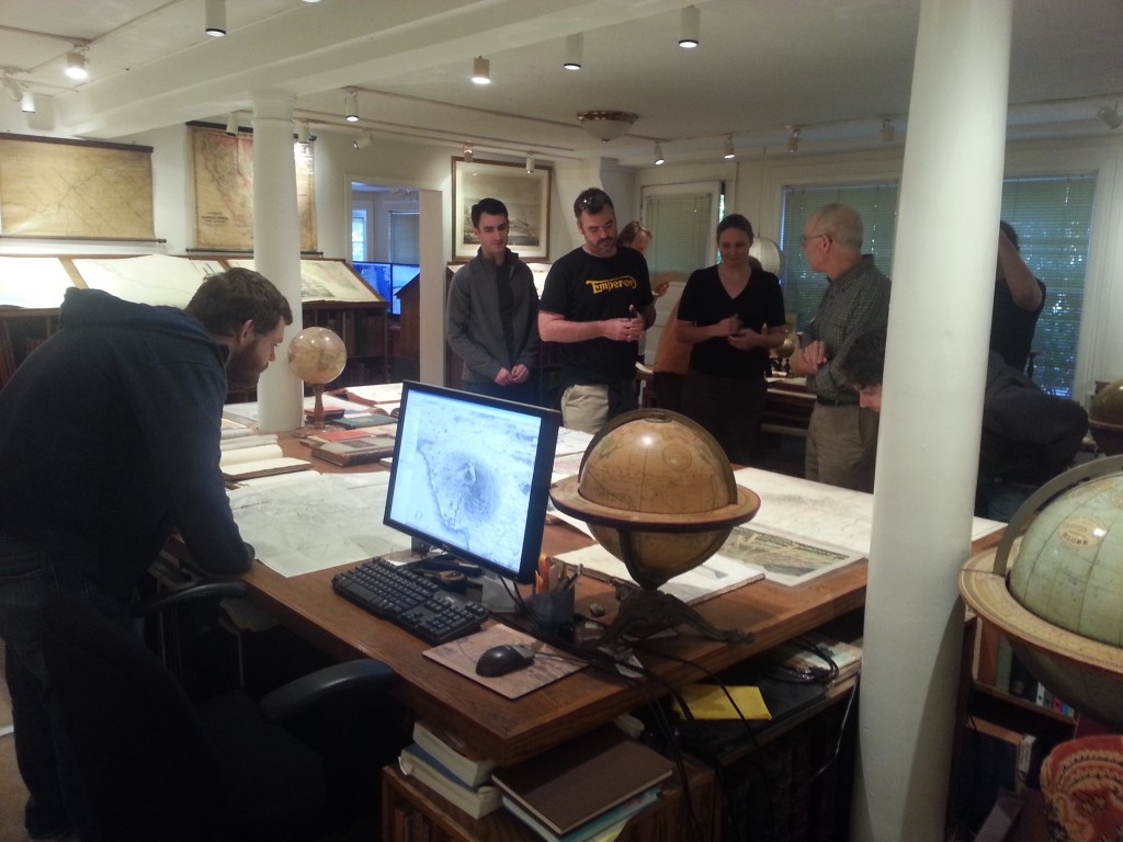
Couple more shots of the map room.
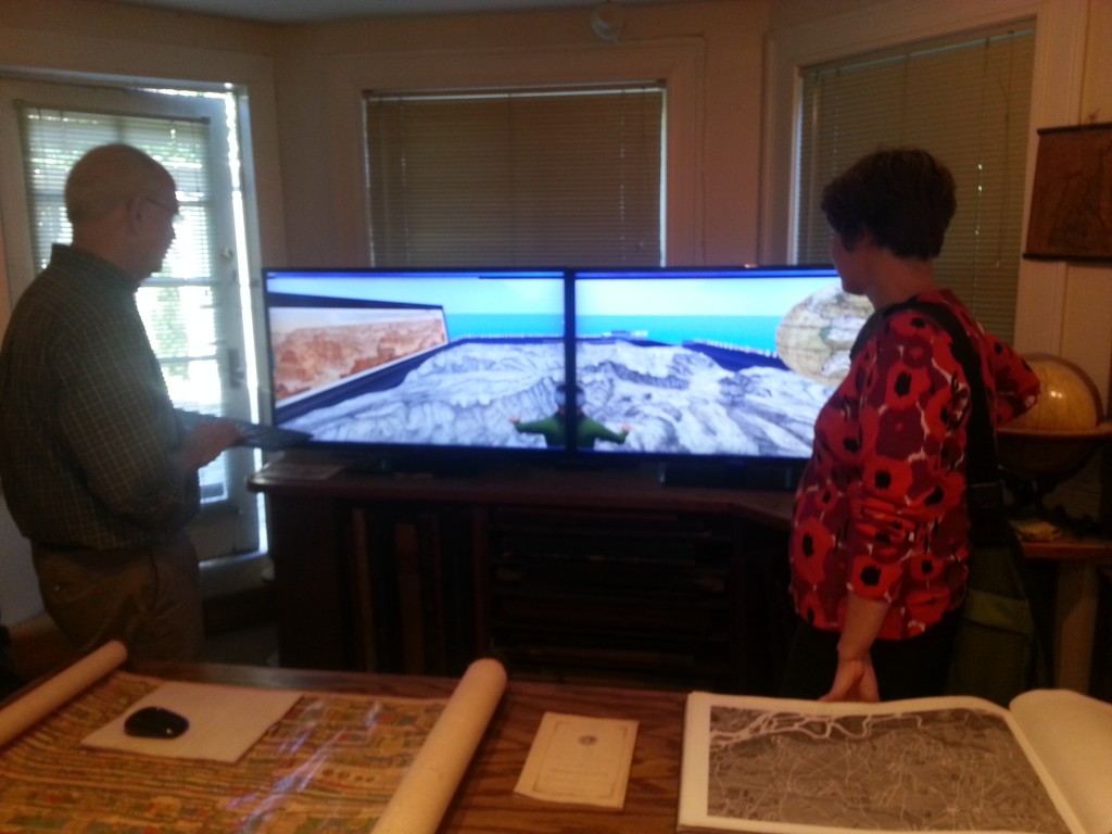
I’m going to put in an IT request to get two of these in my cube – dual 50” monitors with extremely high resolution, shown below in a crappy picture.
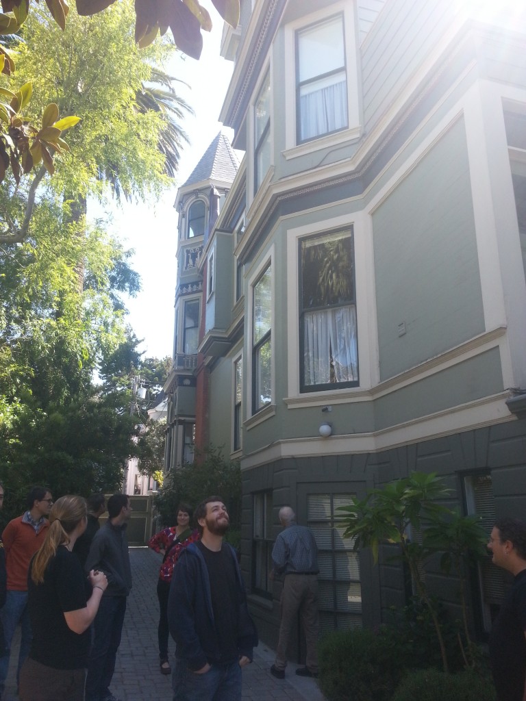
Off to the map digitization studio, this is a shot of the side of David’s sweet pad.
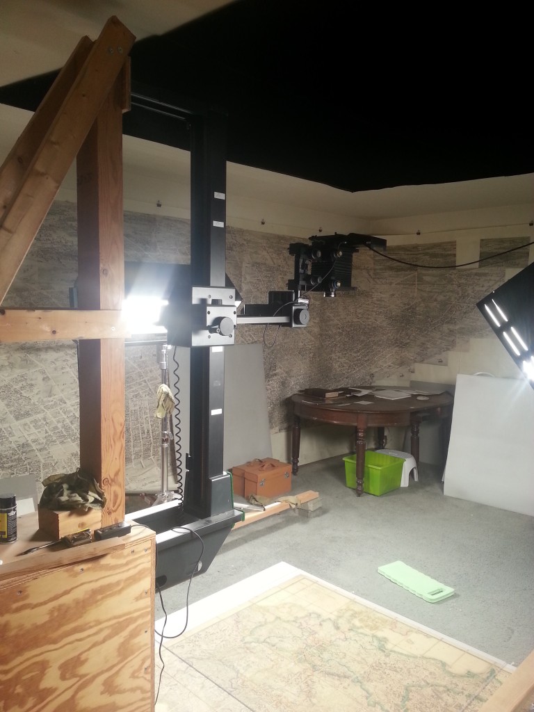
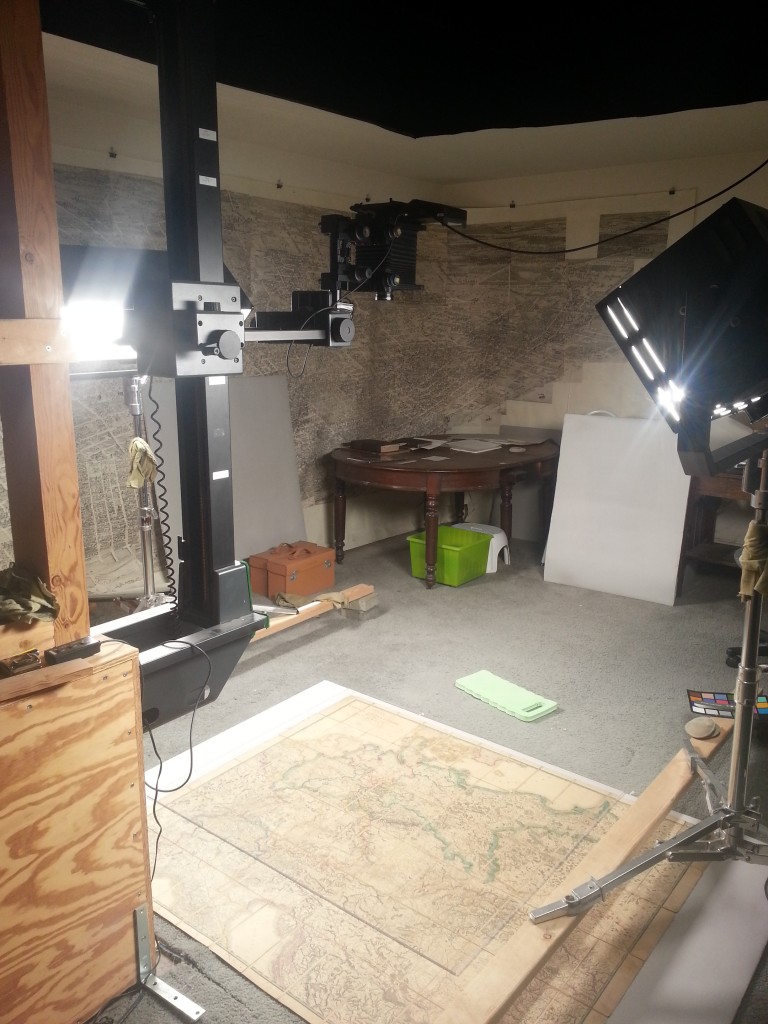
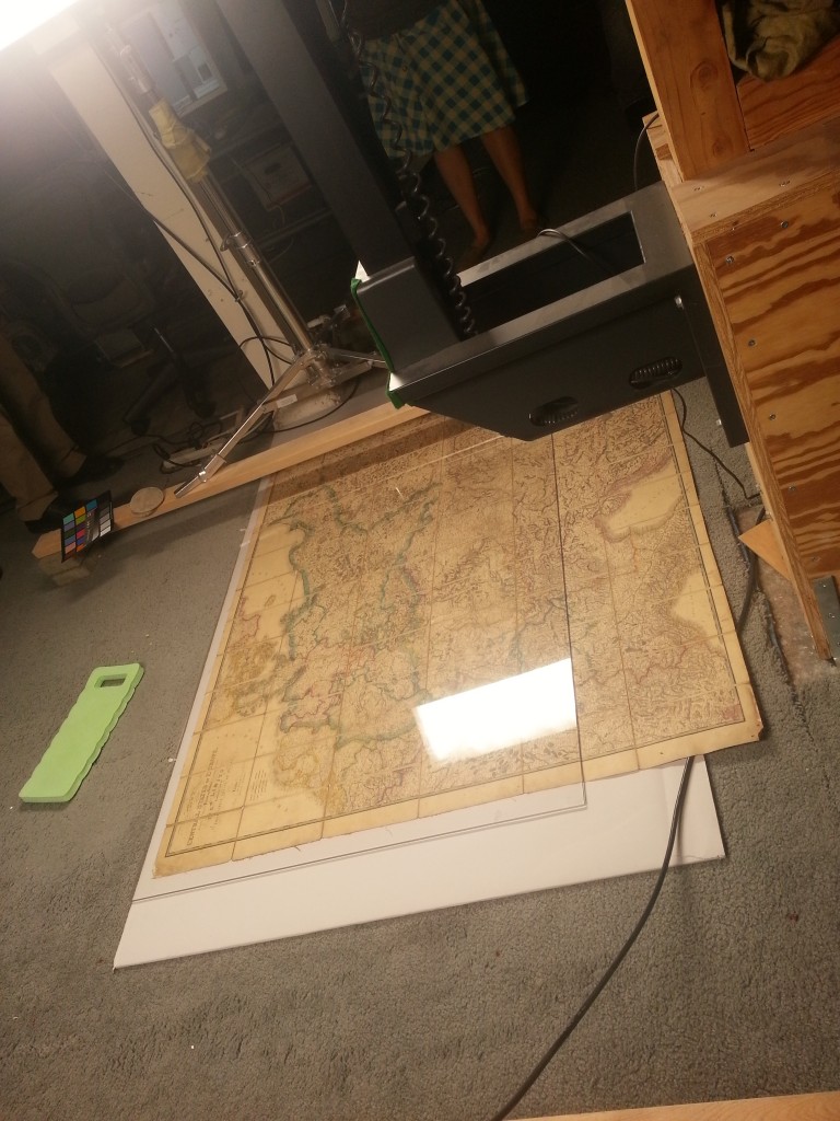
Below is a high resolution camera mounted to take directly vertical shots of the maps at varying resolutions. The camera takes a series of 1 vertical pixel by ~5000 horizontal pixels images which are merged in photoshop on machines with 60GB of RAM. The camera mount sits on neoprene feet so that vibrations from surrounding traffic do not affect the images captured. The maps are placed on the ground with glass over to keep them flat and illuminated from each side at an angle by very high frequency lights. The lights were recently upgraded to these higher frequency lights because formerly some shots were taken while the camera and lights were out of sync – affecting the exposure of the images.
The map being digitized.
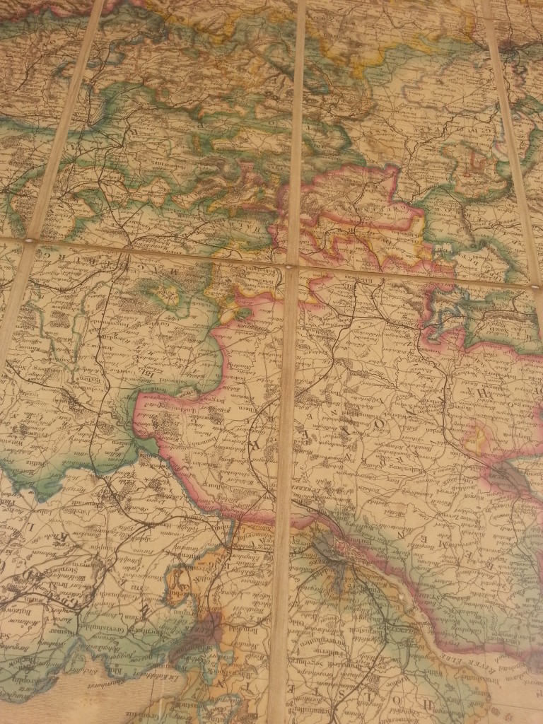
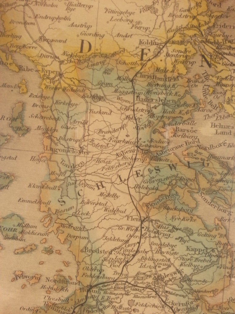
Very subtle but notice the double band on this feature. There is an initial light brown band that turns blue. I assume the two different colors signify separate things. Also notice that the saturation of color is very subtle, a technique that could improve many maps.
A huge thanks to David Rumsey for sharing his home and his map collection. Another thanks to event organizer Stephanie Cowles and my colleague Devan Morris for giving me the head’s up on this opportunity.





1 Comment
JRigs
June 10, 2013I see you located Stank Ho. Good work.
Fantastic stuff, thanks for sharing.