Fusion Table InfoWindow
I set this web map up to communicate some personnel stats for planning staff. The client didn’t want a static map. Using a fusion table/map is a fairly easy way to set up a nice looking interactive map. One of the cool features of this one is the dynamic charting in the infowindow for each office point. The chart references information stored for that point to draw the chart on the fly and reflect data stored in the table.
I’ll focus on setting up the infowindow html in this post but here’s a quick overview of how I set up the fusion table in the first place.
1 – I created the shapefile for each office with staffing figures, percentages, office name, etc attributes in ArcMap (this is a good time to think about the type of information you might want/need to display in the info window because that information needs to be stored in the table)
2 – I used Quantum GIS to export that shapefile as a kml (not kmz!) [it’s just easier for me to use Quantum over ArcMap – better results for creating exporting a fusion table]
3 – In google drive hit create > More > Table & import the kml [you’ve got to have a google account to set up a fusion table]
4 – Name the table something meaningful & finish
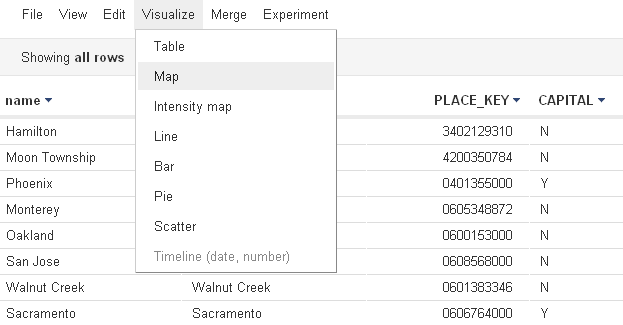
Now that the fusion table is set up, you should see the attribute table – hit Visualize>Map.
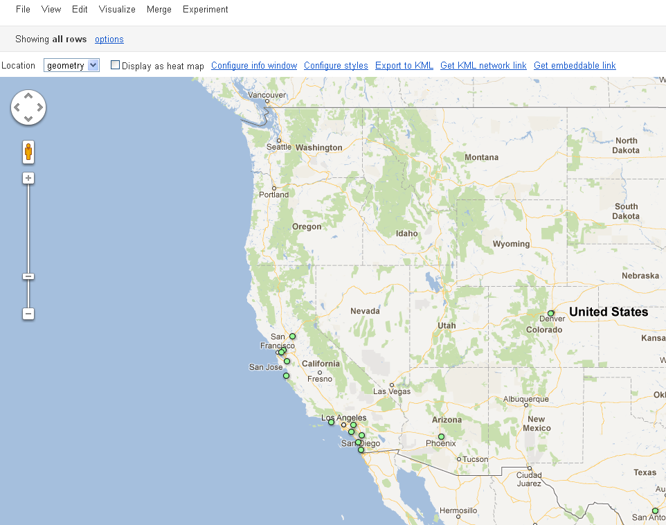
Now you should see your map.
When you click on a point, you’ll see a default fairly boring infowindow displaying some of the information in the table connected to those spatial data.
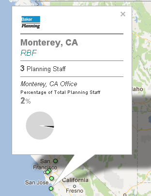
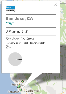
I’ll show you have to spruce it up a bit and create something that is aesthetically pleasing and a little more efficient at communicating the information buried in the attributes of each point. I’m going to show you how to set up the infowindow shown here:
First off, to better understand the code I’ll be showing you you can brush up on html at w3schools.com or just use it as a reference for the code I’ll show you.
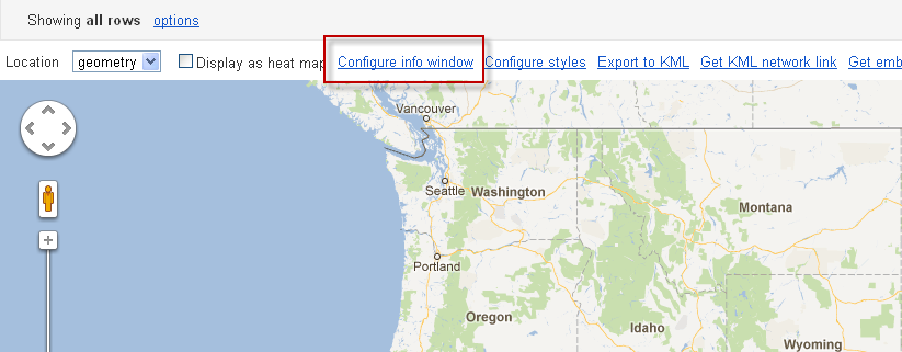
To get started, hit the Configure info window button in the map view.
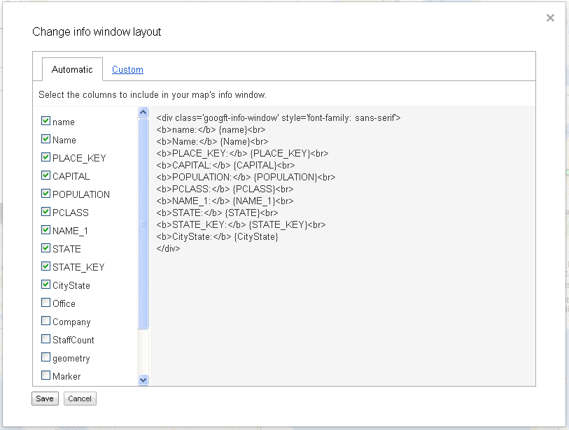
In the automatic tab you can simply choose which attributes from the table are shown in the infowindow of each point when clicked on the map and google styles it for you with some automatic/generic html formatting.
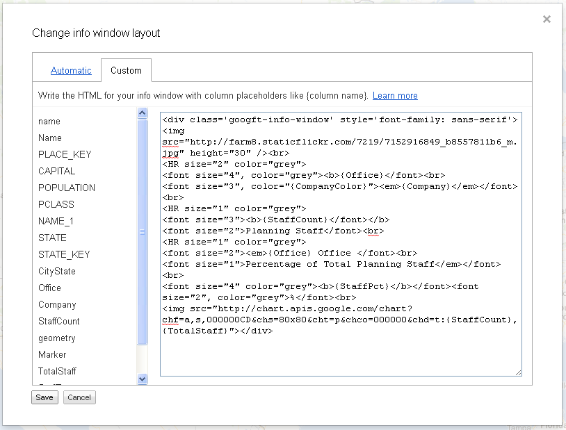
Go to the custom tab. Here’s the code for the custom infowindow I showed above.
Here’s the code so you can copy/paste and experiment:
div class='googft-info-window' style='font-family: sans-serif'>

<img src="http://farm8.staticflickr.com/7219/7152916849_b8557811b6_m.jpg" height="30" /><br>

<HR size="2" color="grey">

<font size="4", color="grey"><b>{Office}</font><br>

<font size="3", color="{CompanyColor}"><em>{Company}</em></font><br>

<HR size="1" color="grey">

<font size="3"><b>{StaffCount}</font></b>

<font size="2">Planning Staff</font><br>

<HR size="1" color="grey">

<font size="2"><em>{Office} Office </font><br>

<font size="1">Percentage of Total Planning Staff</em></font><br>

<font size="4" color="grey"><b>{StaffPct}</b></font><font size="2", color="grey">%</font><br>

<img src="http://chart.apis.google.com/chart?chf=a,s,000000CD&chs=80x80&cht=p&chco=000000&chd=t:{StaffCount},{TotalStaff}"></div>
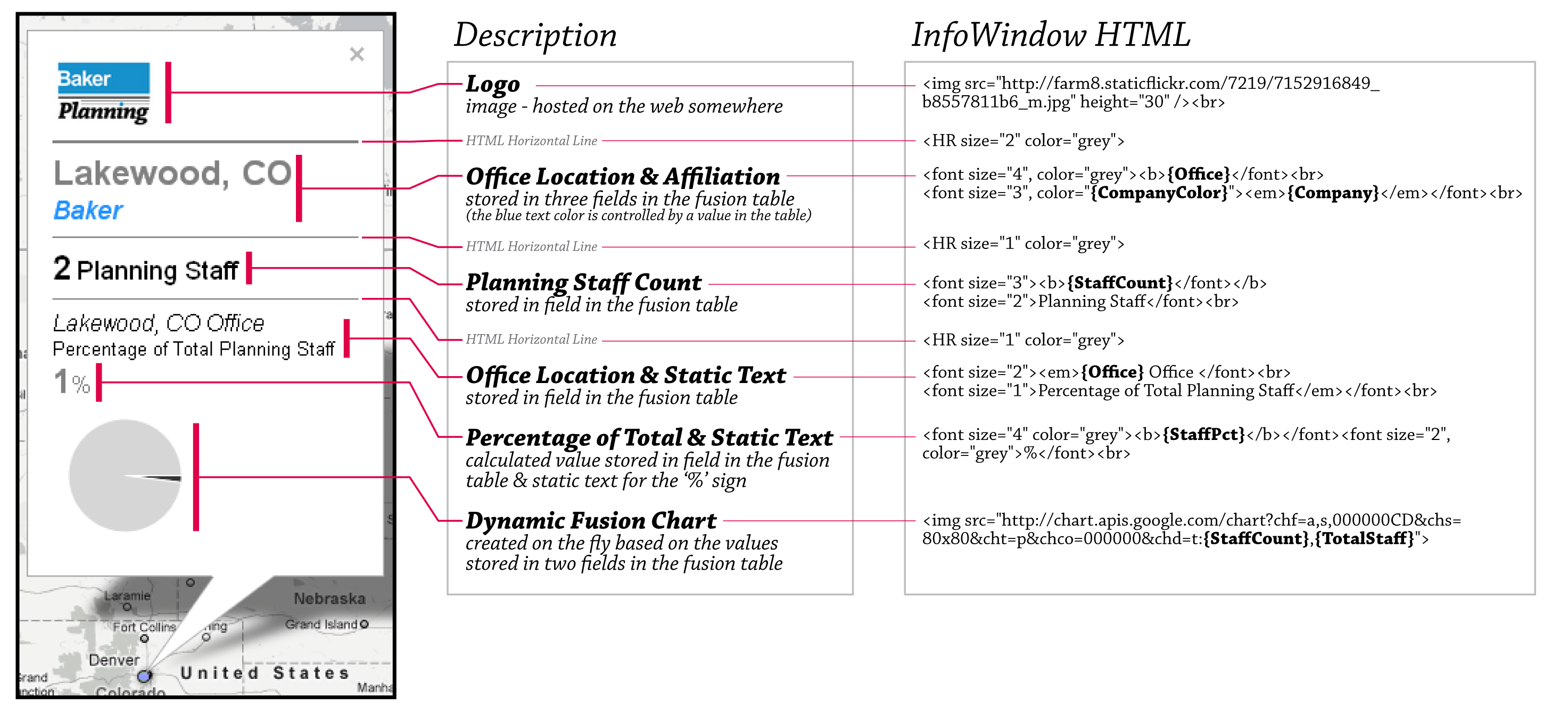
Here’s how all that code corresponds to what you see in the infowindow. I’ve bolded any field name (references to the attribute table) that I’ve used in the code. Also notice that the color field is wrapped in quotations as it defines an html color name and needs quotes for proper html formatting.
The only real tricky part in this code is the dynamic chart. It took a little trial and error to set it up correctly. I used the chart wizard from google to format this chart, see http://imagecharteditor.appspot.com/.
Basically, each part of the chart url in the infowindow code control how the chart looks and the data it displays. In the chart in my infowindow, I am displaying the proportion of the staff in that office to the remaining planning staff company wide and I reference two fields from the attribute table in the chart’s url. (study the code!)
Press save and you should now see a formatted infowindow.
Now you can embed the map into a website using the Get embeddable link button in the map view of the table.
The table I am using in this example is public, you can view the attributes below – unfortunately, you cannot edit the infowindow. You can copy the table if you have google drive set up, go to File > Export then Save as CSV then go to your google drive account and create a new table by importing the csv you saved (then you can actually see and edit the infowindow code I’ve created):
https://www.google.com/fusiontables/DataSource?snapid=S498378FrN5




1 Comment
JFarrow
October 4, 2014This is a terrific tutorial for fusion tables. I’ll be sharing it with my fellow land surveyors. Thanks!