Map Typography – Titles
An easily overlooked part of building maps is typography. I’ll continue a series of articles that will help you choose and place type on your maps (look for “Map Typography” in the article title). This time I’ll cover some basics and pointers in creating nice, effective titles and title blocks in this article.
Making typeface choices may seem silly to many but the type on a map is the voice of that map. The type is there to be seen and read; the visibility, recognition and legibility of the type on a map is vital to sound cartography (Robinson, 407). I actually like pondering type decisions and enjoy testing different combinations of typefaces, colors, sizes, leading and tracking. I think an interest in typography and skill in choosing typefaces and typeface combinations is vital for cartographers.
I like to pair typefaces and/or styles in map titles. This is especially effective if your map has a subtitle or some other elements beside the title itself. I like a strong sans-serif for the main title text with the subtitle in a different style and almost always a smaller size. An easy way to change the style of the subtitle is by using a serif typeface. Serif refers to the smaller lines used to finish off a main stroke of a letter – the text in my articles is set in a serif font while the titles are set in a san-serif (Robinson, 407). There are a few more considerations and cartographic rules for feature-labeling type which I will cover in upcoming articles.
Keep in mind that mixing styles in titles can mean much more than just mixing serif and sans-serif typefaces. Think about color, case, spacing and size. The cool thing about designing title text is that there are no real rules. There are guidelines to achieve good aesthetics but experimentation and tinkering will lead to a good design. This can be frustrating but try to enjoy the process and stick with it, with practice you’ll develop a style and create titles that look and work great. There’s a great article at smashing magazine that outlines some best practices of combining typefaces, see the link at the end of this article (1).
Title blocks include more than just a map title, they can include supplementary elements like legends, scale bars, scale text, inset maps, credits, source citations and many other possibilities. An important thing to keep in mind when designing a title block is hierarchy. Think about what the reader should see first, second, third and so on. Design the size, color and style accordingly.
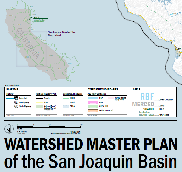
In this title block there are multiple elements including an inset map, a legend, north arrow, scale bar and title. Notice that the title incorporated two different styles, the top line is all capital letters and the second line is proper case. I’ve mixed styles here but there’s no real subtitle. See, no strict rules, I played around with it and I like the outcome. Even though the first line of the title has a smaller point size, it’s at the top of the hierarchy here, I read “WATERSHED MASTER PLAN” before anything else when I look in the title block area. The mixed styles give the typography dimension and make it interesting. Notice the alignment of each element or set of elements as well. Think in terms of grouping, the inset map is a whole, the legend is a whole, the north arrow & scale bar are a whole and the title. These are aligned on their left edge and spaced vertically at equal increments.
When laying out title blocks try to group like elements into simple rectangles. Compose the smaller pieces, the grouped elements, into the whole. Remember that visual hierarchy will always affect your design and make sure you design the most important pieces to be seen first and detail or supplementary information to be seen upon further inspection.
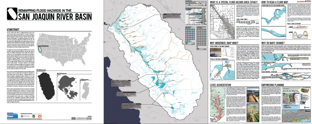
The grouping is apparent in the Solano County map title block. The rectangular groups are composed into a rectangular title block. The first thing the reader will notice and read is likely the title “Solano County” then maybe the credits or scale information. Notes on the map data and technical information are provided but are set in much smaller type and fall to the back of the visual hierarchy in this map block.
This title is on a poster of 3’ x 9’ and needed to be big and legible from a distance. That’s a big poster and I gave a lot of real estate to the title block because if the poster caught someone’s attention, I wanted them to know why they should come over and read the content. The title conveys the idea of the poster content and does a good job at letting someone yards away know it. Also notice the incorporation of the subject as a graphic symbol as a title block element (be creative!).
Typography is very interesting to me and I obviously think about certain elements of a map (title blocks) a lot more than other people might because typography is a very important part of cartography. With a little practice, some research (aka studying) and creativity anyone can create sound title blocks. Remember that visual hierarchy and mixing styles are key. Generalizing elements of the title blocks into geometric groups and composing those will simplify the process of designing title blocks and will lead to aesthetically pleasing and professional cartography.
Any requests or concerns with these guidelines? Comment below!
References
1 Combining Typefaces http://www.smashingmagazine.com/2010/11/04/best-practices-of-combining-typefaces/
2 Choosing a Typeface http://www.smashingmagazine.com/2011/03/24/how-to-choose-a-typeface/
Robinson, Arthur H., Joel L. Morrison, Phillip C. Muehrcke, A. John Kimerling, and Stephen C. Guptill. Elements of Cartography. Sixth ed. New York: John Wiley & Sons, 1995. Print.


1 Comment
Aaron Smith
May 9, 2012Wonderful and helpful article. I will be putting this new knowledge to use immediately!