Text Masking Gradients
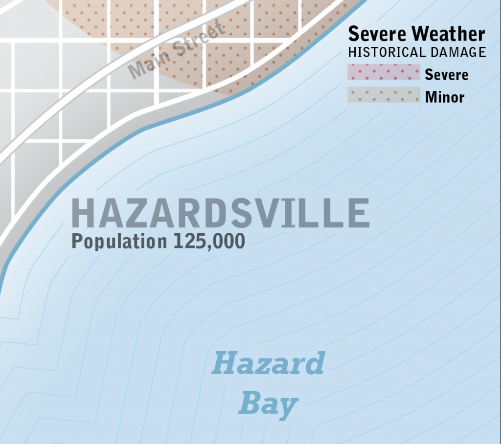
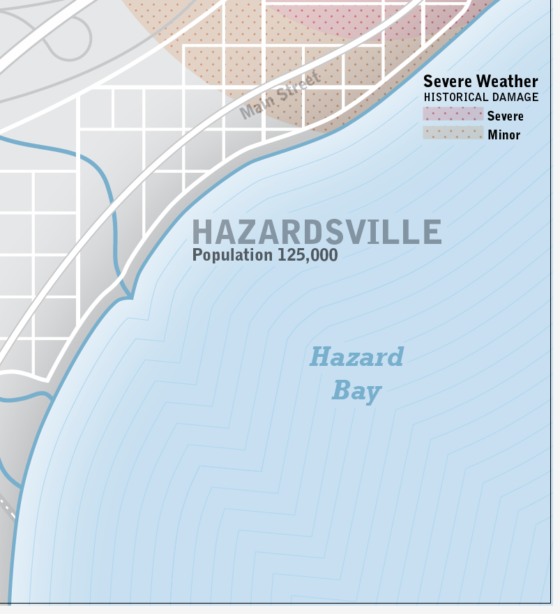
I’d like to share a masking technique that I recently used in Illustrator (CS4). This technique involves masking lines around text labels that are drawn over a water body with a gradient effect fill. Notice in the image below that the thin isoline effect is masked around the labels yet the shoreline gradient effect is uninterrupted. Here’s what the masked labels look like.
Notice that the labels span the various colors of the gradients applied to the water body. For example, the H in the Hazardsville label is over a much lighter color than the E in the Hazardsville label. My goal is to mask the thin blue isolines so that they do not travel behind the labels. I want them to take a break behind the labels.
I could create and assign a character style with a blue stroke matching the the ocean fill to the Hazardsville text but it wouldn’t match the background color for the whole word – it might look like this:
It’s tough to match to the background color because there is a slight transparency applied to the text and the stroke doesn’t do a great job at matching the background or masking the isolines.
The main water body polygon and the isolines are two separate entities. The isolines are based on and built from the original water body polygon.
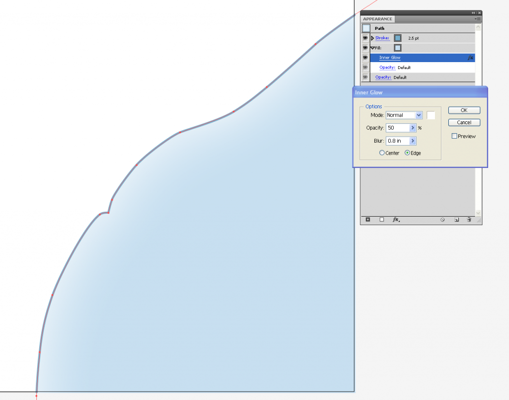
The water body polygon has a clipping mask applied just outside the art boundary. The polygon also has a darker blue stroke at the shoreline and a white inner glow radiating from the shoreline.
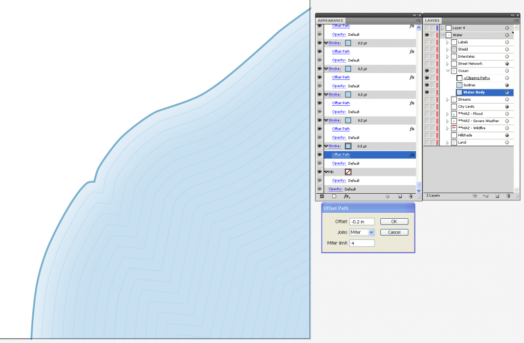
This is the water body with the isolines effect. This is created with a copy of the water body polygon. To create this effect, copy the water body polygon (you can do this inside the clipping mask) and paste in front. Remove the fill and inner glow effect, then lighten and decrease the size of the stroke. Highlight the stroke in the appearance panel and apply the offset path effect. I’ve offset each isoline at -0.2 inch intervals. Once the first offset path is done, the stroke can be highlighted in the appearance panel and duplicated. For each duplicate, increase the offset increment by -0.2 inches. This effect took 26 offset stroke layers to complete the effect. Not a very fun process but the effect can be saved as a graphic style for later use. Here’s the isoline effect, the corresponding appearance panel and the layers panel for this symbology.
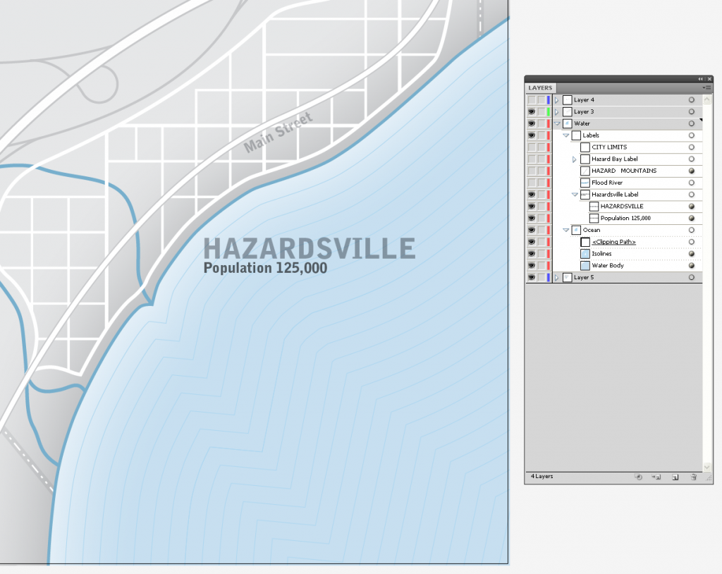
Now that the water body symbology is set and I’ve added a label over the water body for the city (this graphic is a depiction of hazards in a fictional city). Here, I’ve added the city label and I’ve also turned on the city basemap.
The label looks ok at this point and the resulting map would be fine but I’d like to mask the isolines around the label for a slightly cleaner, more legible label.
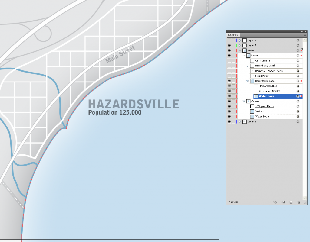
The first step is to copy the water body and paste in front. In the layers panel click on the path copy and move it up into to the ‘Hazardsville Label’ group under the text. Here’s what it looks like.
Notice that the polygon I copied now extends beyond the original clipping mask (because I took it out of the clipping mask and it now covers the isolines/water body symbology. The next step is to draw a polygon around the Hazardsville label that will reflect the extent of the isoline mask.
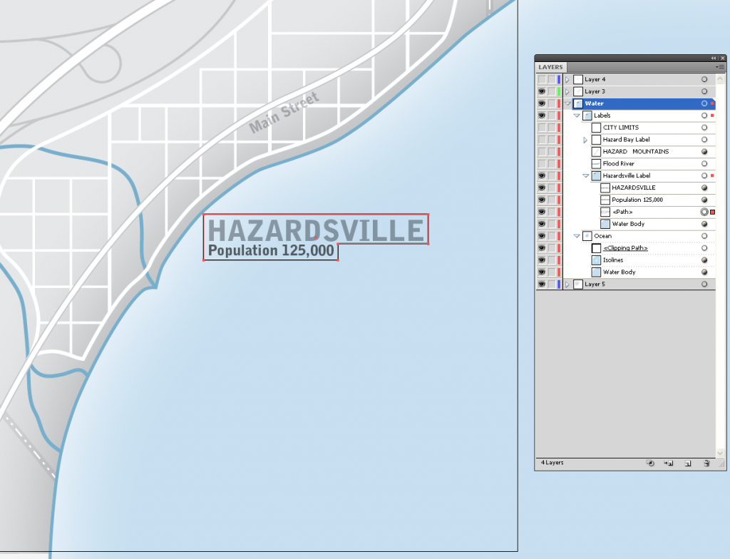
This is the masking extent. The next step is to clip the copy of the water body polygon with this path. Don’t worry too much about the exact size/shape of the path at this point, it can be adjusted after creating the clipping mask.
Now select both the masking extent polygon and the copy of the water body path making sure that the masking extent is above the water body path copy in the layers panel. Next, right-click the extent polygon and choose make clipping mask.
Notice that after making the clipping mask, the water body path copy is grouped with the clipping mask and that the isolines are now masked around the label, based on the masking polygon I drew.
The mask does not interrupt the appearance I created for the water body but it nicely masks the isoline effect around the Hazardsville label. The shape of the clipping mask can be adjusted with the direct selection tool. This is a nice finishing touch for labels that are placed over gradients and need to be masked. This is a portion of the finished map with a few other labels that share this masking technique.
I use this technique often to create a professional look. This masking technique produces a subtle and elegant cartographic effect I hope you can use in your own maps.






1 Comment
sue hawkins
September 7, 2017Very nice!
I haven’t used a gradient in water bodies very often; so it has been easier for me to just make a dupe of the text, slide it in back of the original text, then make an outline of appropriate color on that background text. That’s how I make my text masks.
At work I don’t have access to Illustrator. Is there any way to emulate this effect in ArcMap 10.3.1?
You rock, Brian.